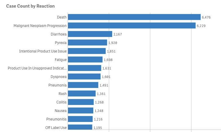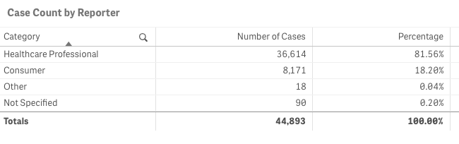
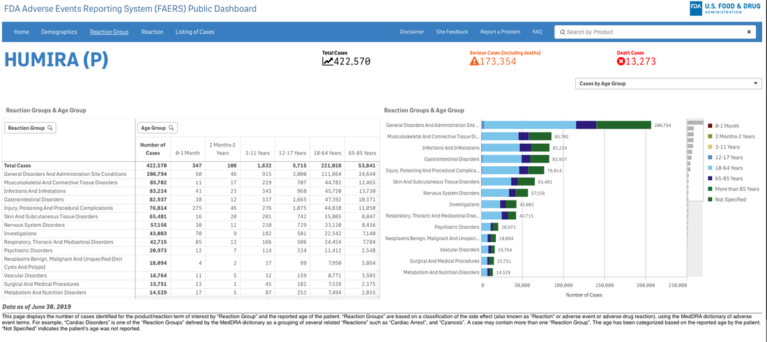
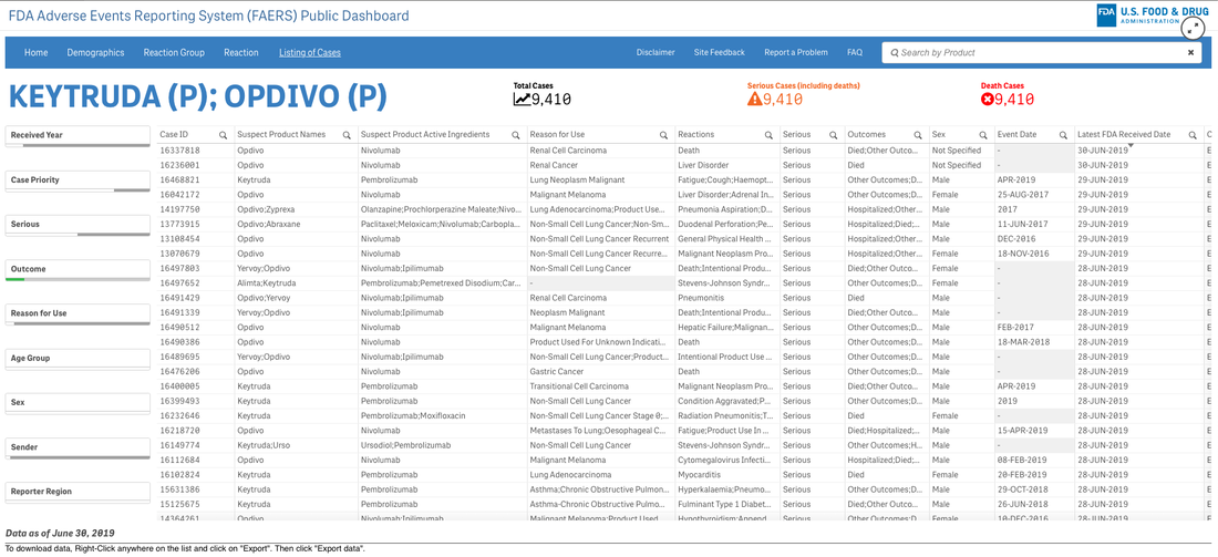
Let’s pretend (similar to my last project) that you are an academic center with a robust CME department. You want to avoid data dumps and attempting to educate community oncologists or physicians on simply the epidemiology. They know the science--the problem is, the data is problematic. For example, in the last 5 years there have been 28 randomized controlled trials published. If I decide to limit to simply clinical trials, there are 71. If I filter simply by key word search immuno-oncology and 5 years, there are 1,761 results. Educators need to start here. Focus and distill the information into meaningful topics. A recent article, Clinical Trial Evidence Supporting US Food and Drug Administration Approval of Novel Cancer Therapies Between 2000 and 2016 revealed the following key points: Question What are the available data on cancer treatment outcomes for new cancer therapies approved by the US Food and Drug Administration? 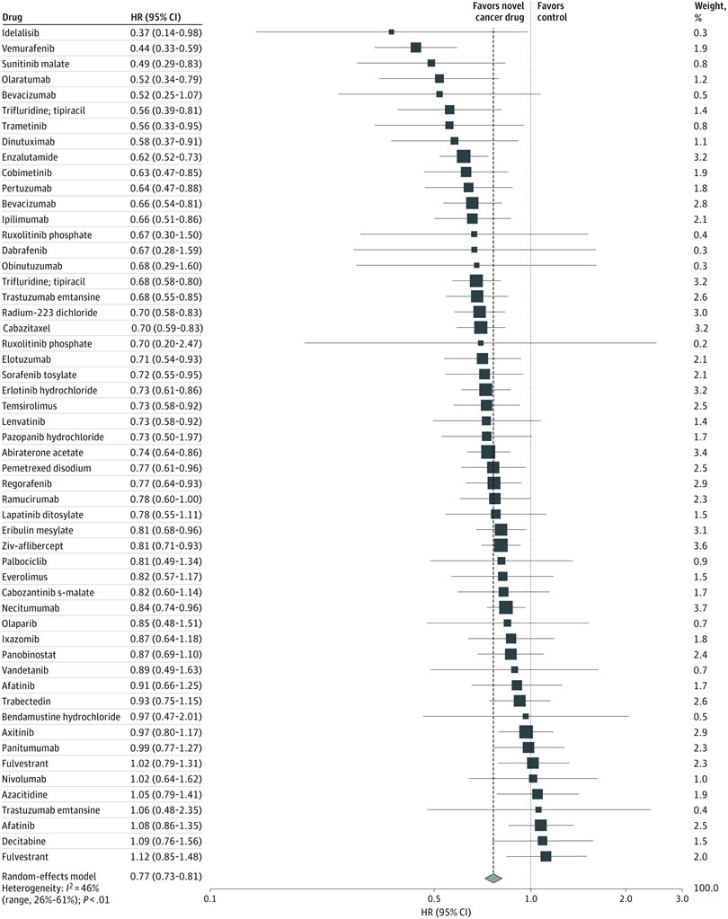 I don’t want to gloss over the importance of understanding a clinical graphic (you need to learn how. Period.) but in this case I found the data in this clinical report secondary to identifying the education gap for health care providers treating patients at the point of care. Which patient might benefit, from which drug, at what cost, and at what dose? Interviewed physicians revealed they had no idea the overall survival benefits were so small. First, we can explore the FDA Adverse Events Reporting System (FAERS) Public Dashboard. I am picking a drug for purposes of demonstration--I selected nivolumab from the graphic above, brand name Opdivo. Opdivo has a broad list of indications and although FAERS is free, I recommend using MedDRA (small fee) for complete data. But for our illustrative purpose--this will be fine. What we see in the data (search term “nivolumab") shows that there were 44,893 adverse events reported in FAERS. A total of 40, 152 are reported as serious (including deaths) with 13, 549 deaths reported as of June 30th, 2020. As we search for a focus for an educational intervention, although healthcare professionals reported the AEs 81% (36,614) of the time, patients or consumers reported 18% (8,171).
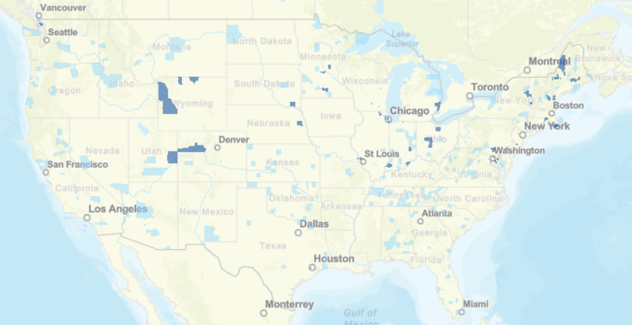
This list is certainly not complete but I wanted to show how a small fraction of available data can yield big insights for developing need assessments or any conversations about therapeutics--especially comparative highlights. There has been interest in examining inequity in screening and diagnosis for a variety of cancers. I am picking an example from one of the indications of our reference drug, nivolumab. Interesting trends to examine that begin to diverge after mid-forties. 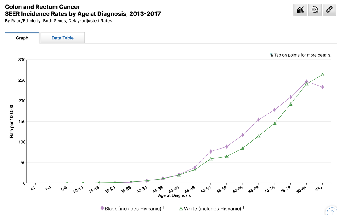 When working with populations, it is also important to locate demographic challenges to care access. There are many variables to examine, but here is one that is available from Health Resources & Services Administration (HRSA).
Do you have any data questions? Click the collaborator page and enter your data challenges.
We might select your challenge for the next round of data sourcing.  The term "flagship" denotes a highly valued asset. Quite often the most impressive or revered holding of a brand or company/organization. Sounds nice to me but boring. I doubt they are looking to be too extreme or forward thinking with this precious "holding". Why fix it if it isn't broken? What we need in medicine are a few pirate ships scattered throughout the fleet. Risk takers willing to challenge the status quo for not only better questions--but more challenges of "established" answers. The behavior of ideas as they jump from person to person has the same pattern as the spread of the Plague. Both are described by the same mathematical model. Physicians tell me all the time--they are overwhelmed by the volume of medical literature within their specialties and across medicine in general. There is data to support this. Case in point. I went to PubMed (and their newly designed interface) and entered oncology 2020. It isn't even February yet and it yielded 12,181 results. Scimago Journal & Country Rank provides information on journal and country ranks and also provides a few visualization tools. The graphic below shows the % cited documents and cites per document. I tagged the oncology documents so we can get a general idea of where we are compared to other cited documents. Hovering around below 40% with less than 1.2 cites per document. 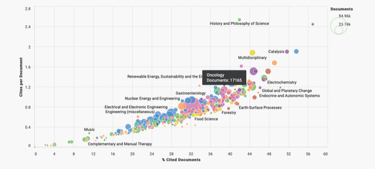 Now if we are looking for a measure of document volume look at our Medicine bubble below. Yowza. What is going on here? My first thoughts point to the lucrative journal and subscription markets in Medicine. According to 2015 data the value was more than 25 billion dollars. In 2019, Vox news reported that the UC Sytem in California dropped its $10 million-a-year subscription to Elsevier. Not to alarm you dear reader but me thinks perhaps all is not above board in medical publishing. As Vinay Prasad MD, MPH, says, its the flow of money through the system that is corrupt. 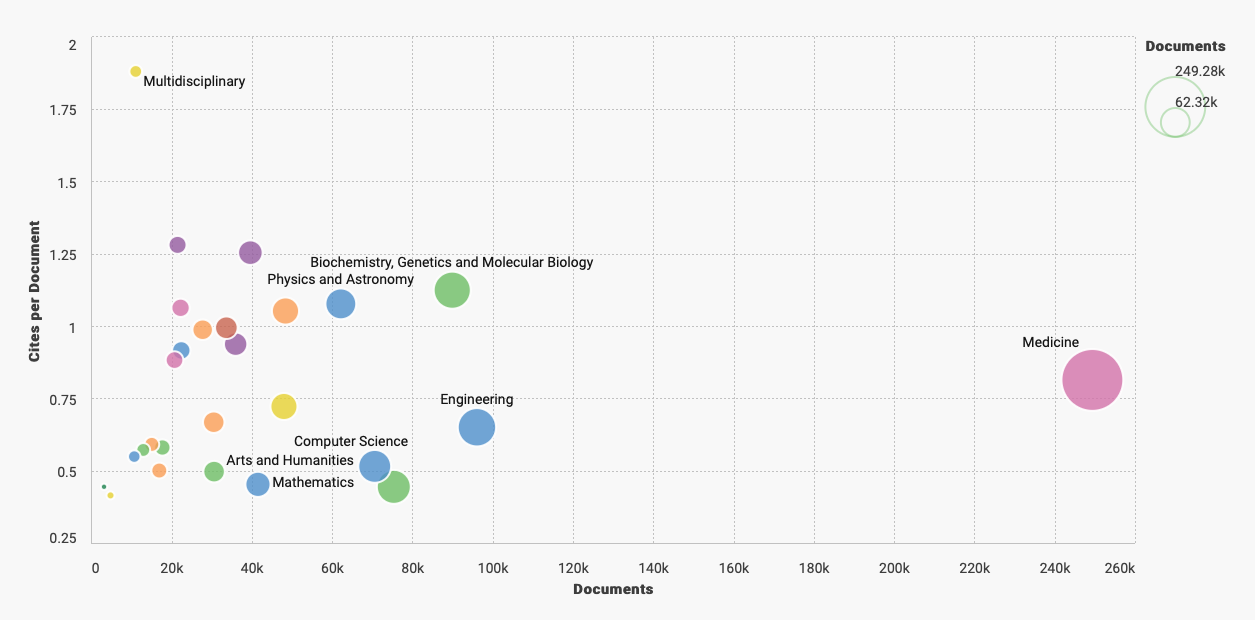 The h-index on the x-axis below is an author specific metric that reports productivity by creating an index of author's most cited papers combined with the number of citations they have received in other publications. Oncology continues to reign supreme when compared by influential authors ranked by their H-index. 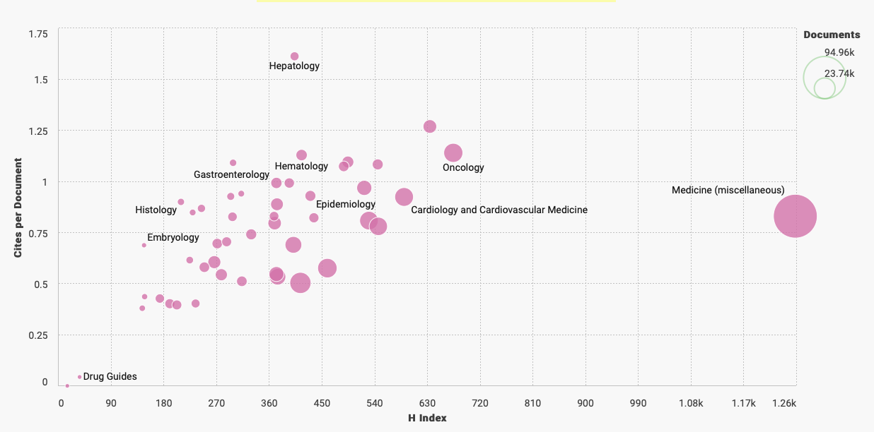 What we actually need are more primary endpoints that measure overall survival, better statistical models, and less low hanging fruit. We need more pirates mateys... 
A company with the tagline "Grow Your Pharma Business Digitally", Pharmacompass, assembled this data--or at least that was the attribution provided on LinkedIn. I bristle at the scale of revenue and how many link this to innovation or advances in scientific research. True, there are moments of genuine groundbreaking discovery but I would argue they are few and far between.
It is okay to report the revenue but if we are being true stewards to patients, communities, and national health we also need to hold the tension of what might be festering below the surface. 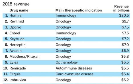
I lecture about prevention upstream from disease quite often--pointing to data that examines water quality, air toxicity, agri-business, social determinants of health, and a wide variety of variables we should be examining in the name of improving health. But like everything in our current environment--profit is king.
When I tease out metrics of innovation I tend to go more granular than stakeholders prefer. That's okay with me. I no longer accept projects where clients have a clear objective and request data sourcing that supports their premise. Why not formulate the data question and see what data best contributes to the facts? Listen to Vinay Prasad, MD, MPH and hopefully you will become more critical of eminence based medicine and more familiar with evidence based medicine. This particular podcast (link below) where he takes you step by step through a careful review of BEACON clinical trial is riveting. His reasons for being skeptical about the role of medical writers is exactly why I no longer write on assignment. Well, hold on. I would write on assignment if it was less secretarial (write this but not that) and was strictly focused on a 360 perspective of available data--but... Vinay also wrote this editorial in theBMJ, BEACON trial in colorectal cancer is “single worst reported,” says critic You can understand his point when you listen to the podcast either before or after you may have seen the press from ASCO Post Staff: 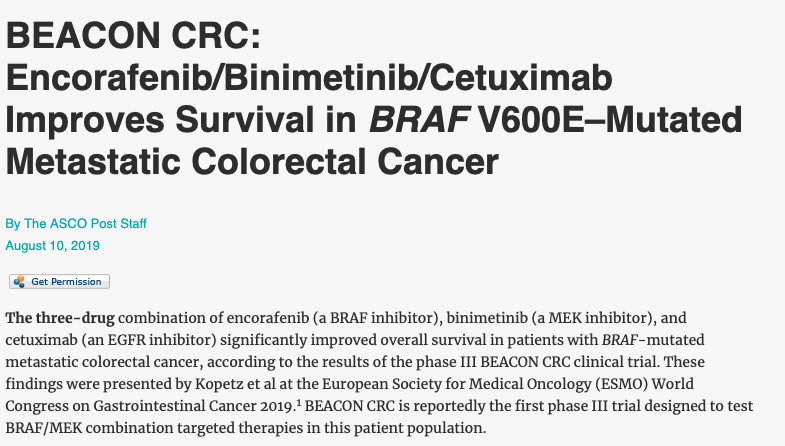
As a recovering medical writer I now rely on data to inform conversations and narratives in medicine, health policy, and health economics. Through a series of workshops I will walk you through a data source and share the tools (free and open source) useful in bringing data into your insights either at the individual or enterprise level.
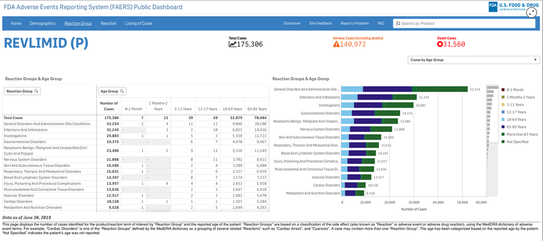
A survey that circulates every year about need assessment writing in continuing medical education continually demonstrates to me that we need these skills. Not the ability to code in Python but the ability to perhaps write a single line of code that can analyze a dataset or generate a visualization. If you are curious about the cost of innovation, here is an easy dashboard you can begin using right now--no data manipulation required. I recommend that you familiarize yourself with the FDA Adverse Events Reporting System (FAERS) Public Dashboard. 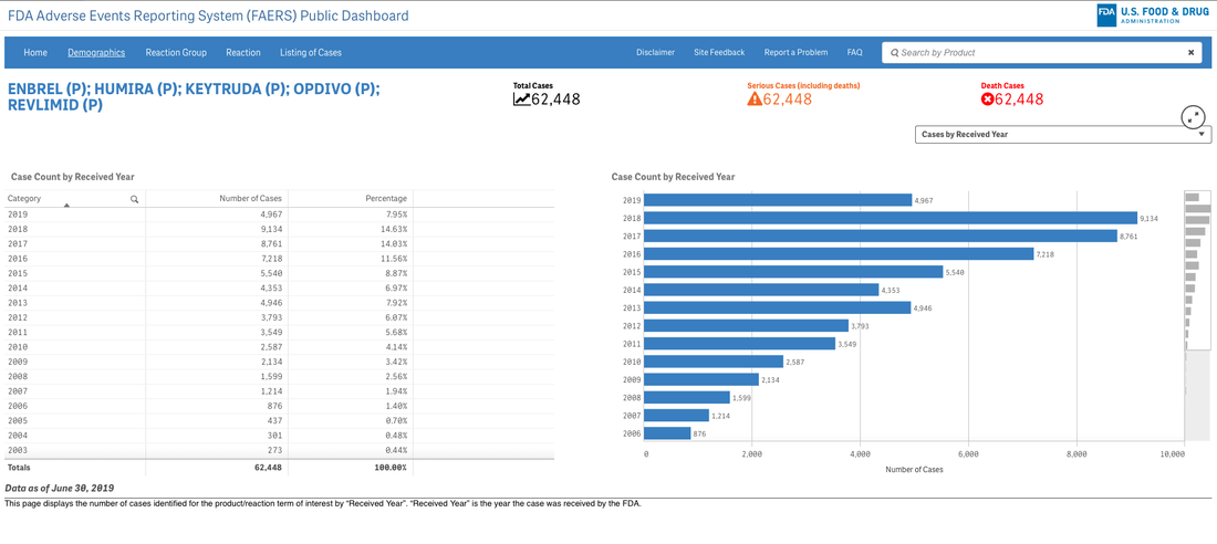
These interactive dashboards available at FAERS website reveal the people and lives behind the dots on a graph. The data is only as complete as those that report the numbers and there are many unanswered questions.
What was the quality of the clinical trials that brought the drugs to market in each indication? What would we think if we knew then what we know now about risk/benefit in a wide variety of heterogeneous populations?
Go to the website and explore the data. Next time someone writes a catchy headline about innovation and how that is captured in the price of investigational products and marketed drugs--ask about the bits they aren't capturing. Someone might just have their finger on the scale...
New workshop: Big data on a less big budget...
Save 25% on Women in Tech Summit with coupon code: SPEAKER25--only a few tickets left!
Tableau Fringe Festival 2019--October 25th
New in 2020...Intro to Data Visualization and Tableau
I have been pretty consistent over the years in several regards. I begin most days running trails or training, I am an early riser, a voracious reader, and I have no idea what clients think they are measuring when they ask about "race" either in survey demographics or as a dimension in analysis. As a recovering bench scientist, I am aware that groupings by race show less inter-group variability genetically than inter-personal differences within the population at large. Basically it means we are all the same. Race science has been debunked since World War II although there is a group of avid scientists that got the memo but either aren't reading it or have too much to lose if they did. I have read about different rates of hypertension in black cohorts for example but we aren't offering meaningful biologic causes--and why do these differences disappear in African countries? It would appear we have home grown factors here that bear examination. Instead of creating arbitrary cohorts based solely on "race" shouldn't we ask if oxidative stress differences might be attributed to other social and political factors? How is this possible if we rely on underpowered check-box mentality towards race? The centuries-old belief in racial differences in physiology has continued to mask the brutal effects of discrimination and structural inequities, instead placing blame on individuals and their communities for statistically poor health outcomes. 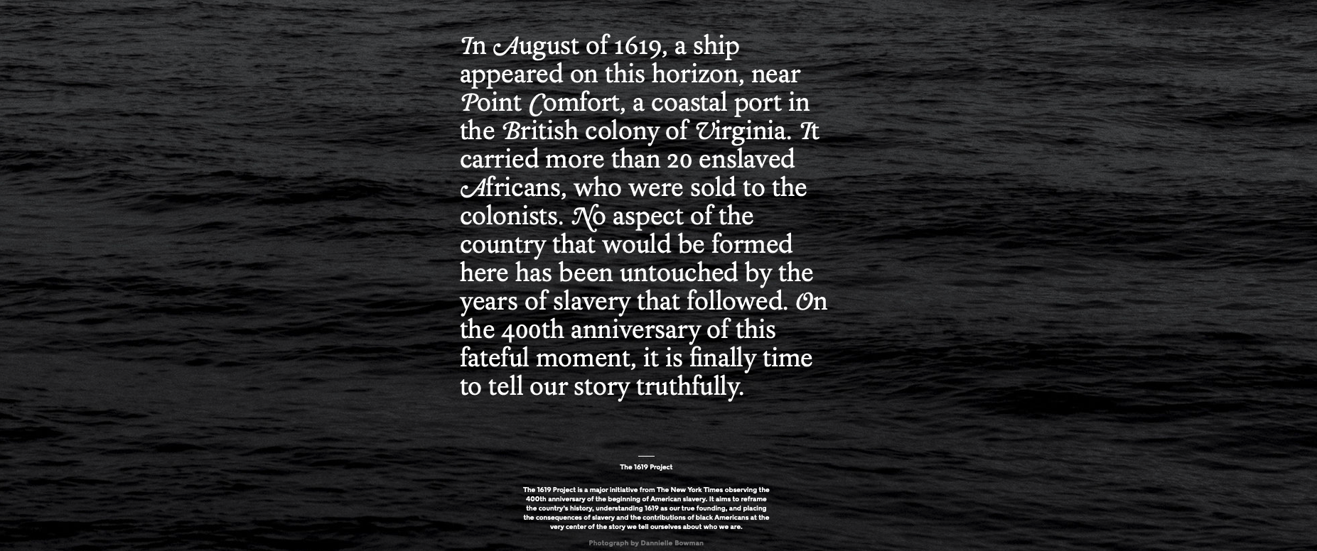 Although 1619 leaves many gobsmacked regarding the roots of slavery in the United States--the actual date is even earlier. "The Spanish took enslaved Africans to a settlement in the present-day Carolinas in 1526. The slaves rebelled, and the settlement failed. Also, the Spanish took African slaves to St. Augustine, Fla. — which, unlike the Jamestown colony in Virginia, still thrives — in 1565--Rex Springston, Virginia Mercury If only for historical curiosity, these stories from the New York Times are timely and at the same time quite overdue. My initial quest began when I had to figure out what to do with the data. Race is a poor biologic proxy because it is and has always been a social or political construct. As an analyst I either need the social construct you seek to measure or I need the actual biologic entity you seek to evaluate--just collecting race is useless. I can do a little bit if we capture ancestry as we anticipate genetic drift to be associated with geographical origins but again, in the absence of a well-formulated question or hypothesis it isn't as relevant as you might think. A recent article in JAMA Oncology wields race into a surprisingly quotidian narrative. The argument seems to be we need to improve recruitment of minorities into clinical trials but falls apart when there isn't really a compelling data infrastructure for yielding meaningful insights if this goal was achieved. Are we measuring the right things or just data mining for signals? For trials that did report on race, there were notable disparities in the makeup of participants. White patients accounted for 76% of study participants, while Asian patients accounted for 18%. What exactly is a black patient? Is the presence of identification as black even relevant? Think of the diversity or stories of origin of this deeply heterogeneous population. Would findings from someone from Ghana be able to be extrapolated to individuals from say Somalia? Is the perceived appropriateness and political correctness of African American as a descriptor clouding our short sightedness of grouping every "other" according to the melanin in their skin or other phenotypic characteristics? It is unreasonable to assume that classifying individuals based on an entire continent of origin would yield granularity needed to answer a data question or hypothesis. Disparity of Race Reporting and Representation in Clinical Trials Leading to Cancer Drug Approvals From 2008 to 2018--link to article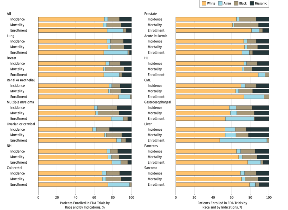 The JAMA article does mention (right before the conclusions) "We also recognize that social, economic, and environmental factors are equally important factors in propagating disparities in cancer care." If equally important, we need to be having those discussions and selecting additional variables to capture these factors and include them in analyses. One final thought, the elephant in the room is the lack of upstream research and funding into the multi-pronged causative factors of cancer. The research describes water toxicity, poor air quality, stress in general, inadequate nutrition, low education, access to care, inadequate livable housing, influence of agri-business, and a myriad of societal and economic drivers of low health. How would these 4 racial groups rank on exposure to these known social correlates of health and disease? Is this an opportunity for medical intervention or societal and political reform as prevention? Courtesies of a small and trivial character are the ones which strike deepest in the grateful and appreciating heart--Henry Clay  He uses statistics as a drunken man uses lamp posts - for support rather than for illumination--Andrew Lang, Scottish poet.
I am not a statistician. Having said that, I have on the other hand, taken multiple higher level courses in statistics over the years. I attend statistical conferences, workshops, and do a lot of independent reading in biostatistics, medical statistics, and multivariate analysis. I would argue the fact that this is perhaps more than the targeted readers of our most esteemed medical journals--or at least on par.
But I am often left scratching my head. In workshops, after a proper visualization history and priming I begin with a relatively simple graphic. An enthusiastic volunteer will often comply with my request for a headline for the graphic. The sort of headline we would like to see in a clinical journal not necessarily in digital or print journalism at large. I would argue--based on dozens of data literacy in healthcare workshops--this is where we are losing our audiences. Complex curves and obtuse statistical models are not communicating effectively in the absence of context. Often, authors report intent-to-treat analysis but a granular examination of data describes censuring of data (the measured event doesn’t happen while the subject is still being monitored)--did they die or drop out of the trial? Why do I mention this? More than once I have raised my hand at international statistical conferences asking who the target audience is for the messages they are hoping to deliver. Esoteric phrases that include terms like heteroscedasticity, eigenvalues, or the relevance of long-rank stratification without explanation or clarification continue to isolate the importance of numeracy. I am like you. I read the clinical literature especially when something highly anticipated is reported. You might be surprised that although there is no shortage of buzz around immuno-onocology drugs we have none that report benefit over standard of care or placebo based on overall survival. Benefit has been demonstrated in select patients with respect to progression-free survival but I would say there is much we don't know about patient selection, durable effects, and how to translate the findings. 
BACKGROUND
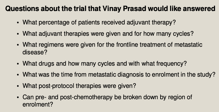
As a long-time reader/listener of Vinay Prasad--most recently his podcast Plenary Session has been quite illuminating when interrogating the methodology of complex speciality drugs in oncology. Although I urge you to listen to the entire podcast--it is over 2 hours--I have pulled a few salient questions for consideration.
The point of randomized clinical trials is to examine if investigational drugs are better than currently available drug regimens before, during, and after the clinical trial. An interesting point observed during the podcast questioned the number of patients in both active and control arm that appear to not have been assigned subsequent therapy. The methodology mentions intent to treat populations but it isn't clear (at least to me) if all patients were included in the analyses. I have included the Kaplan-Meir curves and forest plots from both trials discussed on podcast. It is helpful to listen with the visual so you can follow the discussion, criticism, and limits of the insights to be gleaned from the what at first glance appeared to be pivotal findings. Here is the Palbociclib over survival curve and forest plot... 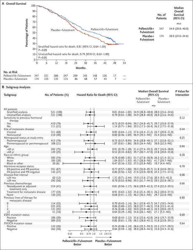
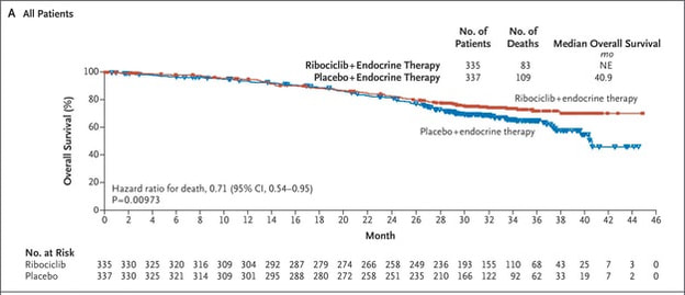
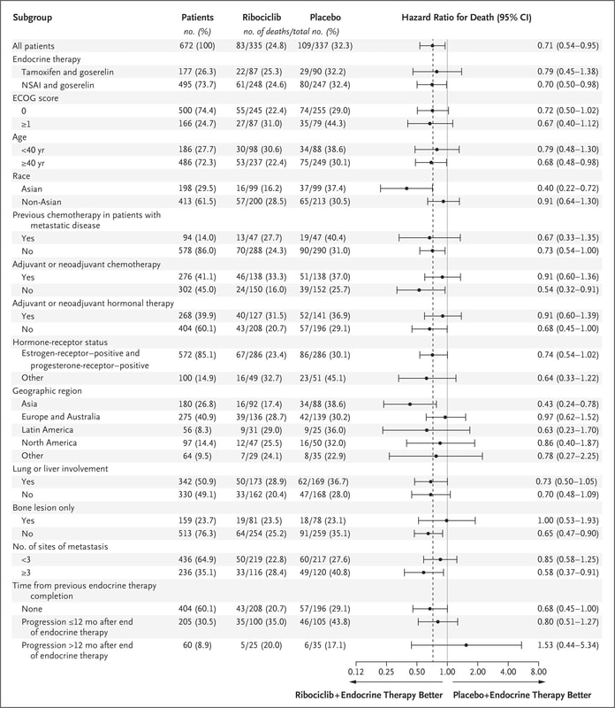
Now compare to Ribociclib clinical trial...
We can also observe regional issues as mentioned by Dr Prasad during the podcast.
Why does this all matter? Because there is so much to appreciate and evaluate when looking at clinical research. It isn't just about running data or understanding the statistics, it is often about digging deeper.
Think of what is missing not just what is being displayed in the graphics. The pertinent negative... 
 A recent article in thebmj, Maximising the impact of patient reported outcome assessment for patients and society discusses the importance and limitations of patient reported outcomes in directing appropriate high-value healthcare to patients. Data governance is typically missing or tossed in as an afterthought so this figure and the contextual integration of the process is important--and captured my attention. 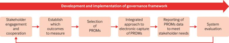 My expertise has defined my major collaborative efforts as designing survey instruments, providing an overview of a data governance strategy or where to integrate into existing systems, and as peer reviewer for Patient Centered Outcomes Research Institute (PCORI) data methods and implementation. Many clients rely on Patient-Reported Outcomes Measurement Information System (PROMIS) measures developed with National Institutes of Health (NIH) funding. For the most part, I am not a fan. I can appreciate the need for standardization of instruments for interoperability but it is a bit of a Heisenberg Uncertainty dilemma--I would argue the generalization of measures influences the outcome. "The uncertainty principle says that we cannot measure the position (x) and the momentum (p) of a particle with absolute precision. The more accurately we know one of these values, the less accurately we know the other."--Alok Jha PRO instruments are anything but standard. A loose classification by the University of Oxford Patient Reported Outcomes Group identifies a variety of instruments, for example, disease-specific, population-specific, dimension specific, generic (SF-36), individualized, summary items, utility measures and so on. Limitations include but are not limited to the lack of application or comparison to general population, few response categories, broad focus, lack of application to real world, many developed in the 90s or older, pre-dating the digital landscape and advanced knowledge of cognitive frameworks, and many other reasons to be wary of the generalized approach to gathering subjective data. The way I prefer to develop patient perspective includes both validated PRO instruments--with aforementioned cautions--and actual patient data reflective of actual patient experiences--reported by patients. This can be complicated from an analyses point of view due to the large contribution of free-text and multi-modal questioning but when over-generalized standardized questions are augmented with ranking questions for example you can actually create a less linear perspective on how patients value inputs and identify missing measures or considerations. Think cinematic, not linear. An additional limitation can be attributed to low rigor of survey questions, choice architecture, limited disease state knowledge in question design, satisficing, and improper analyses. The rise of "do-it yourself" survey instruments has unwittingly polluted the data landscape with worthless noisy and low-value data. Look no farther than personalized medicine to see where we are losing the trees through the forest. We attribute differences in microbiology and biochemical profiles to meaningful clinical outcomes that for the most part, have not materialized. “Research is formalized curiosity. It is poking and prying with a purpose. ” -Zora Neale Hurston Here is a pre-proof short little book I wrote several years ago about survey writing. It isn't meant to make you an expert but it is meant to instantly improve your survey development and the quality of the data you are collecting. I was an invited reviewer of an academic text, The Palgrave Handbook of Survey Research and distilled the most important but often overlooked habits of good survey design.
We are launching our new data portal where data literacy is embedded with storytelling, analyses, and visualization--Datamonger.health--take a look.
 Are you still shocked about how many data projects are understaffed, poorly defined, or lack an overall cohesive strategy or purpose for the data? Because I work with data and maybe even more specifically in my role as a curator of data--I spend a lot of time listening. I listen to patients. Not little dots or circles described enthusiastically from the podium at JP Morgan Healthcare Conference as "expanding market share" but independent advocates, thoughtful executives, and physicians/healthcare providers at the point of care. I also made an observation. The closer the "expert" is to the patient, the more trustworthy they seem to be. Although I also work in health policy and health economics, the patient is way off in the distance. An ideal, rather than someone with an actual seat at the table. Business models swirl around each node in US health systems but we should not lose sight of the real objective--improving patient outcomes and prevention strategies upstream from disease. Why are we lamenting the closure of hospitals and condensed networks of health systems? Isn't that what success looks like if more and more people are healthy? 2018 is the first year in recent memory where I stepped away from the office during the entire holiday season. Okay maybe there were meetings here and there but mostly with clients that have become friends over the years. Projects have grown beyond the data itself and into the architecture driving governance strategies and frameworks. “Data”, runs a common refrain, “is the new oil.” Like the sticky black stuff that comes out of the ground, all those 1s and 0s are of little use until they are processed into something more valuable. That something is you. We see data everywhere and have discussions of objectivity and rigor in attempts to identify, clean, collect, analyze, and visualize. But what if we are identifying sources of information that support our prevailing beliefs and ideology? More than once, clients ask for the outcome without ever identifying the question they seek to answer. Are we doing the same thing? Even raw data has been selected and processed. An important quote by Nick Barrowman states that "data is always the product of cognitive, cultural, and institutional processes that determine what to collect and how to collect it." “Raw data” is both an oxymoron and a bad idea.—Geoffrey C. Bowker, Memory Practices in the Sciences Transparency in the selection of datasets, data models, and even the data you leave out because of budgetary limits should all be disclosed. My goal for 2019 is to encourage more collaborative partners to participate in the selection of entities, relationships, and attributes in building models. Knowing how we build the models expands the team knowledge of how questions should be articulated and considered. Paul Edwards defines “data friction” as—"friction consisting of worries, questions, and contests that assert or affirm what should count as data, or which data are good and which less reliable, or how big data sets need to be". I think about this a lot when analyzing oncology data. It is hard to compare multiple trials without noticing the broad selection and interpretation of surrogate endpoints, homogenized patient populations hardly representative of actual real world clinical environments, and the aggregation of data from disparate sets as representative of a single patient's "best" treatment algorithm. I recommend listening to Vinay Prasad MD MPH either by following on twitter or his recently launched podcast, Plenary Session. You may not be a data scientist but you do need to be able to read graphs and charts. You need to know when something stinks. Especially in oncology where we seem to suffer from a bit of dissonance. Why are we not able to accept failure in oncology clinical trials? Randomized controlled trials are conducted to minimize confounding. Not only measured confounders but those we aren't aware of. The group think is that variables will be evenly distributed across prognostic groups and minimize any impact. Vinay reminds us of this when he notes how p-hacking and negative studies exhaustively mined for anything positive--may actually introduce confounding we already mitigated by randomizing.
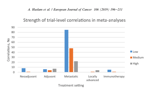
Vinay Prasad also has perfected the slow jam of tweet threads. One of the final of 2018 arrived with a ribbon on Christmas Eve 2018. This article was among the 15 most interesting things he read, listened or saw in 2018. The full paper is available on Google Drive, A systematic review of trial-level meta-analyses measuring the strength of association between surrogate end-points and overall survival in oncology. The graph below depicts the evolution of trial-level surrogates as evidence over the last ~ 18 years. 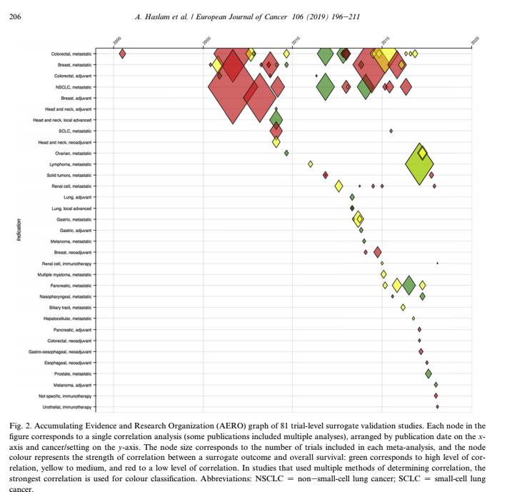 When reading clinical trial results or attending conference proceedings note the trend away from comparable and meaningful measures of proof and think about the data you need to see. What is meaningful in the clinical environment and what is a signal--barely detectable but audaciously hyped. The singular datum is not the particular in relation to any universal (the elected individual in representative democracy, for example) and the plural data is not universal, not generalizable from the singular; it is an aggregation. The power within aggregation is relational, based on potential connections: network, not hierarchy.
There is a lot of money to be made in a wide variety of therapeutic areas. There was a time when all of this excess made me angry. If you have ever held the hand of a loved one as they sighed their last breaths perhaps you understand. It doesn't seem like a time to be evaluating what the market will bear. And yes I understand market theory and commodity pricing but this doesn't apply to the pharmaceutical industry or situations when undue risk is a burden disproportionately handed to those underserved in our communities.
When I had my first son I was shown a luxury birthing suite. The nurse seemed utterly sacerdotal while demonstrating the ascension of the computer from bedside back to ceiling--easy access for entering additional information needed on the fly. Fast forward a few decades and we all recognize hospital speak--billing and accounting for every piece of gauze and bandaid. This video by Kevin (at bottom of post) is the best thing I have seen on LinkedIn for ages. First off, the video adds something. He is engaging and not using video solely because he owns one. It works. The idea of a user manual for leadership style wins the platform. I included his video for you to see what I mean. I also created my own mini guide in case we haven't met. Often cheeky when asked by clients to find data that supports a preconceived claim; I won't do it. Either we look at all the data and see where it leads or no bueno and you need to find another data guide. Where do you put your prohibition icons? 
Writer, data analyst, human: a user guide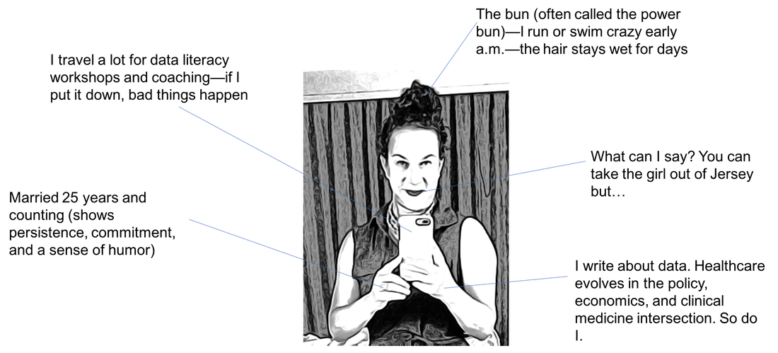
Kidding aside, some days it gets hard keeping the faith. I know many of you personally and a percentage of you support the platform through your generous donations, encouraging comments, or the shared commitment to always remember the patient. The most frequent comments are private accolades from many that have salaries that depend on them believing something different. Apologizing for not "liking" or "commenting" or "sharing" because to question the very industry that generates their salaries is too risky. I get it.
My secret sauce though is assimilating technical information from canonical documents written by scientists and industry experts. At the very least, I have questions. Questions that often are not answered by the edited clinical reports I am permitted to review. You know what I mean. We collectively read the immune-oncology phase II claims of success as the FDA keeps pharmaceutical companies giddy with expedited reviews that may or may not work--and may or may not harm the patient. I have colleagues that point to the success of the 21st Century Cures Act but I recall the diversion of $3.5 billion dollars from the ACA health care prevention fund over a 10 year period. "By law, the Prevention Fund must be used “to provide for expanded and sustained national investment in prevention and public health programs to improve health and help restrain the rate of growth in private and public health care costs.”
Does this bother you? How are you built? What would your user manual say about you?
Maybe we all need to create a user guide. What motivates us? Is it really about profit? Don't some of us "see" the patients through the web of hospital systems, government agencies, payers, and insurance companies? Do you have a compassionate heart and quiet belief that we can do better, listen more reverently, and love more deeply? Not just our own families, but people we may or may not meet each day.
I want to invite you to read a beautiful blog written by a man and woman I do not know. He knows he is dying but isn't afraid to lean into the stillness and wonder of a life albeit too brief but wondrous all the same. Let Life Live Through You is not selling you anything. The blog is a story and a conversation. We are truly being gifted an opportunity to think differently. Don't waste it.

I believe that when you read about Doug--not simply a patient with cancer but a father, husband, and grandfather--you might question the data you are being shown. Question the methodology, the mathematical model, the risk--the cost of a life as you price your device or drug. We are not "increased market share", we are people that live humbly and love deeply.
There are real people hoping and silently praying for a miracle. A well thought out health system that is willing and motivated to reduce their consumer base by healing all of us with clean air, clean water, healthier foods, better choices, and better odds. This feels more like a glide path: I experience an inexorable loss of capacity, with some small short term dips along the way: these are the pains and odd symptoms that just have to be endured: constant exhaustion and shortness of breath, balance and numbness in extremities, little purple spots in weird places. I can deal with these. Thank you Doug for reminding me why I show up every day. And why that matters. Sleep sweet...
To understand the decay in the "truth" of a paper we can measure how long it takes for the citation of an average paper in a field to end. Whether it is no longer interesting no longer relevant or has been contradicted by new research this paper is no longer a part of the living scientific literature. It is out-of-date. The amount of time it takes for others to stop citing half of the literature in a field is also a half-life of sorts.
Why does this matter? Think of how accurate your calculation would be about the decay of a single atom of uranium. It is only when a large collection of atoms have accumulated that we can understand the rate of decay. The law of large numbers is quite simply a law of probabilities--or as the number of events or sample size grows--the difference between theoretical and actual approaches "0" or becomes closer to the average of a population.
In the field of Oncology--and beyond--these are critical points to remember. The problem with modern R&D and discovery is that we are heralding each unique uranium atom and betting on the outcome of the rate of decay. Early research is exploding in the media and investors are frenetic. What we know is incremental. Unless you work in science or clinical research you tend to hear the proclamations and the hype. The problem is each new hypothesis begins with an observation.
It may be a fact today but what happens when replicated or expanded outside of clinically controlled environments? We once waited for data--for certainty or at least the probability of certainty. Now we want to rush discovery into "fact" status at the cost of accuracy or actual scientific methods. If you attended ASCO this year--you know what I mean. Investors want something to believe in and we are only too eager to provide fodder--even if it is quick to decay. Here is a link to tweets on the problem with precision oncology. Vinay Prasad describes the cost of rushing to approve drugs where we lack sufficient facts to be certain that benefits outweigh risks. 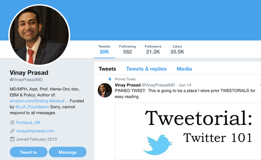
If the topic fascinates you, here are two podcasts that fueled my curiosity. The Half Life of Facts and The Person You Become.
I think the quote, "The Future is already here--It's just not very evenly distributed" is most accurately attributed to William Gibson. I heard it mentioned in passing during a recent London School of Economics and Political Science podcast, Fair Shot: rethinking inequality and how we earn. Chris Hughes had truly innovative ways to rethink how we define and solve inequalities. His new book of the same name is here. Discussions of a basic income guarantee for citizens cite the Permanent Fund Dividend (PFD) paid by the state government to all citizens of Alaska. The state exploits the oil resources and everyone gets a dividend. I am curious if this might be the solution for our healthcare data. We grant access and each participant receives a percentage of the profits generated by the ginormous database. Media headlines in immuno-oncology herald novel and futuristic treatments traveling down industry pipelines to accelerated FDA approvals. But again, far fewer will benefit regardless of the enthusiasm and gargantuan funding for R&D and M&As. This doesn't mean I am against advancements in oncology--quite the opposite. I want to see the data behind the claims and curate insights based on what we know. Not what we "think" we know. I look to leaders in the field such as John Ioannidis, MD and Vinay Prasad, MD not in a sycophantic way but to pay attention to where they are pointing. Estimation of The Percentage of US Patients With Cancer Who Benefit From Genome-Driven Oncology--John Marquart, BA, Emerson Y. Chen, MD, Vinay Prasad, MD, MPHHere is a link to the article. I recommend the granularity and detail presented in the original paper. My interest is always in the data methods and statistical analyses but even if your methodology would vary, the approach is interesting and informative. The authors relied on publicly available data For each drug approval, we catalogued the name of the drug, the date of approval, the specific treatment indication, required genomic testing for that indication, the drug’s mechanism of action, relationship between the genomic aberration and drug target, and the clinical study data, specifically treatment response, per FDA drug label. 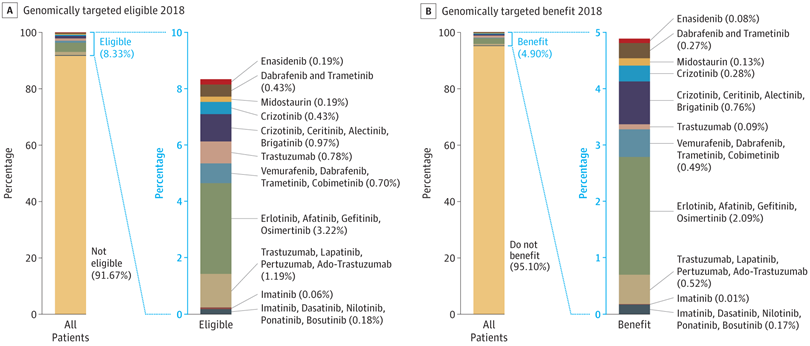 My point in all this is yes, we have made technologic advances but it is only the tippy top of both bars where we can identify eligible patients followed by patients with targeted benefits. We also should be aware that 200+ new drugs approved by the FDA 2010-2016 emanated from tax payer funded research. The figure below is from Galkina Cleary et al., and demonstrates NIH funding year and costs associated with 210 new molecular entities (NME) from 2010-2016 or 151 known molecular targets for these NMEs. "The analysis shows that > 90% of this funding represents basic research related to the biological targets for drug action rather than the drugs themselves." 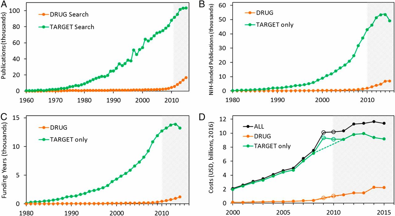 The highest costs are for the antineoplastics as shown here. "The insights and intellectual property arising from this basic research are then transferred to the private sector for development." 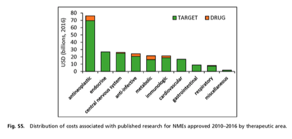 Here is where the pricing and access to potentially life saving drugs becomes interesting--at least from an economics perspective. If you think of medicines as a public good we would further classify them as non-rivalrous (when one person uses the public good, another can also use it) and non-excludable (costly or impossible to exclude someone from using the good). We made health insurance a common good in 1965--think Medicare. If we had adopted the pricing mechanism attributed to Canadian Medicare at that time--It would be the equivalent of 30 trillion dollars in the pockets of US citizens. Now that would have been a more equitable future.  |
|||||||||||||||||||||