 The content below is from my Substack, mumble | delegate | ponder. In this moment of discussions about inequity and inclusion I avoid bombarding audiences with buzzwords and the easy win. Telling people what they want to hear with friendly hand gestures and a lilting voice apparently works for some in the arena of data stories. I don’t see my work as wrapping anything with a pretty bow. I want you to question the granularity of your storytelling and the data you are bringing into the narrative. We need intrinsically and structurally linked historical information to explain the built infrastructure and the persistent yield of differing environments, food access, health outcomes, housing, education, and economic development in our communities. Spatial data is a powerful lens to examine persisting digressions. I hope you find the brief broad stroke helpful in your work with frameworks powered to yield better solutions. Who was Jim Crow and other things we should know but don’t...A fledgling democracy had a problem. Race was not the creator of slavery but it certainly was the consequence. You might be surprised to learn that race was not always a box to be checked. It was invented.
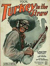
We had the need for more land and oh the Indians were not fond of having their land stolen. There were Native American slaves but this was problematic. The fury of tribes in retaliation for stolen people and land was fiercely making the homeland advantage less desirable for exploitation. Next we tried indentured servitude but after Bacon’s rebellion and similar uprisings it was discovered that only seeded animosity would do the trick. The humanity of blacks would have to be put into question. Demoralization and characterization of their personhood as only 3/5ths of the rest of the populace seemed to generate enough blind eyes to do the trick. A white actor, Thomas Dartmouth Rice, had an affinity for minstrel show performances while performing as Jim Crow—a character based on the lyrics of Jump Jim Crow. I am astounded how many people think Jim Crow was an actual person instead of a derogatory slur against blacks. I would like to think he died along with “the father of minstrelsy” but no such luck. His gravestone in Brooklyn, NY reads: Thomas Dartmouth Rice, the father of minstrelsy (performances by white performers of “blackness” in exaggerated costumes and blackface make-up, supposedly for comedic effect, but relying on racist derision and stereotyping at its core, from the mid-19th century well into the 20th century), died on this date in 1860. No mention of the legacy of a system of oppression and racial segregation inherited by the character he created. Although no longer a stage character, the phrase was reborn in the wake of anti-Black laws conjured up after reconstruction. Another term with a vague understanding, reconstruction was an era between 1865-1877, following the Civil War in an attempt to bring the confederate Southern states and newly freed slaves into what was now in name only, The United States. It was during this time that Black Codes were adopted by many states. Plantation owning elites were keen to recuperate the labor lost by an emancipated people. The United States excelled at maintaining involuntary servitude regardless of emancipation. Mississippi (from wikipedia) Mississippi was the first state to pass Black Codes. Its laws served as a model for those passed by other states, beginning with South Carolina, Alabama, and Louisiana in 1865, and continuing with Florida, Virginia, Georgia, North Carolina, Texas, Tennessee, and Arkansas at the beginning of 1866.[44] … Mississippi was the first state to legislate a new Black Code after the war, beginning with "An Act to confer Civil Rights on Freedmen". This law allowed Blacks to rent land only within cities—effectively preventing them from earning money through independent farming. It required Blacks to present, each January, written proof of employment. The law defined violation of this requirement as vagrancy, punishable by arrest—for which the arresting officer would be paid $5, to be taken from the arrestee's wages. Provisions akin to fugitive slave laws mandated the return of runaway workers, who would lose their wages for the year. An amended version of the vagrancy law included punishments for sympathetic whites. Mississippi rejected the Thirteenth Amendment on December 5, 1865. General Oliver O. Howard, national head of the Freedmen's Bureau, declared in November 1865 that most of the Mississippi Black Code was invalid What you might observe from the timeline below is the delay from Emancipation Proclamation (freedom was not immediate) and the ratification of the14th and 15th amendments, needed for formerly enslaved people to be granted their inalienable rights. On April 20, 1871 the House of Representatives approved “Act to enforce the Provisions of the 14th Amendment to the Constitution of the United States, and for other Purposes.” I am going to guess that you might be surprised to learn it is also known as the Ku Klux Klan Act of 1871. The Ku Klux Klan had been formed in 1865 as a “private club for Confederate veterans”. The Ku Klux Klan Act, the third of a series of increasingly stringent Enforcement Acts, was designed to eliminate extralegal violence and protect the civil and political rights of four million freed slaves. The Fourteenth Amendment, ratified in 1868, defined citizenship and guaranteed due process and equal protection of the law to all. Vigilante groups like the Ku Klux Klan, however, freely threatened African Americans and their white allies in the South and undermined the Republican Party’s plan for Reconstruction. The bill authorized the President to intervene in the former rebel states that attempted to deny “any person or any class of persons of the equal protection of the laws, or of equal privileges or immunities under the laws.” To take action against this newly defined federal crime, the President could suspend habeas corpus, deploy the U.S. military, or use “other means, as he may deem necessary.” Interesting facts about the history of voting in the US
“Fearful that the president might fall victim to a host of civic vices—that he could become susceptible to corruption or cronyism, sow disunity, or exercise overreach—the men sought to constrain executive power consistent with constitutional principles such as federalism and checks and balances.”—Wilfred Codrington III None other than James Madison weighed in on the plight of the Northern vs. Southern States if a popular vote was mandated: “There was one difficulty however of a serious nature attending an immediate choice by the people. The right of suffrage was much more diffusive in the Northern than the Southern States; and the latter could have no influence in the election on the score of the Negroes. The substitution of electors obviated this difficulty and seemed on the whole to be liable to fewest objections.” Fewer legal voters in the South would be problematic for true democracy. Equal populations but unequal numbers of legal voters would be a regional disadvantage in a popular vote. Why not embolden the congressional seating of the three-fifths compromise? The three-fifths compromise was the agreement between delegates from the Northern and the Southern states at the United States Constitutional Convention (1787) that three-fifths of the slave population would be counted for determining direct taxation and representation in the House of Representatives. Changed by the 14th amendment but still allows disenfranchisement by a submerged and majority black population in the South. Approximately 90 percent of the slaves worked in only 5 states! The bonanza of the extra electoral votes combined with non-voting slaves resulted in modern day under-representation, resulting in red state dominance in the South. In fact, it was the election of Republican Rutherford B Hayes despite Democrat Samuel Tilden winning the popular vote that led to the Compromise of 1877. Democrats agreed to accept a Hayes victory on the condition that Republicans withdraw all federal troops from the South, resulting in Democratic control in the region, but the absence of promised protections lead to widespread disenfranchisement of Black voters. The Compromise of 1876 effectively ended the Reconstruction era and protection of black voters, signaling an end to reconstruction and the birth of Jim Crow lawlessness in the South. If no one ever took risks, Michaelangelo would have painted the Sistine floor.-- Neil Simon I prefer audiobooks because I can multitask trail running with my passion for books without having to give up those valuable hours at the end of the day when I fall asleep 2 paragraphs into an anticipated read. But I did find time to read through Risk: A User’s Guide* by General Stanley McChrystal, retired 4-star general in the U.S. Army. *as a member of Amazon associates they give me a portion of the sales if you click through. Easy way to support my work at no cost to you!  The military assessments are riveting but the part I wanted to share really resonates with the data analysis I perform in the healthcare realm. This is also the book I use as a framework for working with health system executives. Confucius says, “The beginning of wisdom is the ability to call things by their right names.” Discussions about risk are no different. Are we envisioning the same threats when I use the word risk? What do we mean when we talk about calculating risk? What can happen when we delay focusing on data that measures risk? Threat x Vulnerability = Risk What a seamless definition of risk. “If there are no threats--our vulnerabilities don’t matter and If we have no vulnerabilities--threats don’t matter The foundation of the book for me is the ten dimensions of control present in all organizations but typically in varying amounts of effectiveness. I am sharing this not as a substitute for the book but to hopefully stimulate the same ‘aha' moment I experienced. Communication: Exchange of information |Clear, concise, accurate, and timely information is hard to come by| Narrative: Telling others what you do |How we think of ourselves--and tell our story--does much to drive our behavior and determine outcomes| Structure: Organizational design and processes |Ultimately, organization matters. An improperly assembled weapon will not fire| Technology: Applying resources and expertise |Technology raises a new question: Who or what is in control| Diversity: Leveraging a range of perspectives |If you don’t see and address a problem from multiple perspectives, you’ll miss something--and it may be the critical thing| Bias: Assumptions of how the world influences us |Just because we believe something doesn’t make it so| Action: Overcoming inertia to respond |Typically, for anything to get done, someone has to do something| Timing: When we act impacts effectiveness of response |When you do something is often as important as what you do| Adaptability: Responding to changing risks |If it’s stupid and it works--it isn’t stupid| Leadership: Directing the overall Risk Immune System(Detect--Assess--Respond--Learn) |Leadership, more than any other factor, can make the system function or fail| Each of the above tactics are explored in detail in the book but I think you can see a path emerging. Combined they are an assessment of an organizational Risk Immune System but that organization can also be an N of 1 independent consultant (me) or a large Fortune 500 company (not me). These 10 elements build the framework for defining a data question, how to respond, select datasets, and execute a plan.
I never argue with Confucius. What do you think? What are you reading? 
For a few hours on a Sunday I try to read something from the list of books, articles, emails, and other things ignored during the work week. There seemed to be more than usual this week so here are a few insights from the pile.
One of the best things about a blog is the archive. Second only to the relationships I have grown with so many of you. First, here is a podcast episode I keep listening to and sharing. Important distinctions should be made between skills and knowledge. I absorbed this through the lens of my work life but I think this is broadly applicable anywhere. Sprinkle it everywhere. I am listening to a podcast episode of Minds Behind Maps. This one is particularly timely. Bruno Sanchez is the, Program Director of the Planetary Computer at Microsoft and the author of "Impact Science: The science of getting to radical social and environmental breakthroughs".
Knowledge can be placed in buckets, skills should not--Bruno Sanches
Anyone working in a scientific field recognizes these buckets. They are deep and not connected willingly from within. We spend so much time positioning our expertise and “othering" our colleagues into their buckets--perhaps to simplify dragging them from the stage of debate.
Bruno brilliantly explains what we lose when we don’t value skills but instead strain our necks to see if the knowledge checklist has been evaluated. My point remains that your scientific, technical, mathematical, focus ignores that we often need more than the facts. “How many people need to die before we understand that facts are not enough? One? Ten? A thousand? This is a blunt question to draw attention to the failure in facts alone, even when lives are at stake.”--Bruno Sanchez, Impact Science, The Science of getting to radical social and environmental breakthroughs.”*affiliate link
Many either new to or trying to elevate careers in data science aren’t feeling the love.
We read the debates over which degree, school, or path to a career in data is the best. None. Hiring managers want the work done. They value critical thinking skills and how you solve problems. The ability to ask data questions and revise them when needed is critical. I would call it common sense but you might already know--it isn’t as common as you think. Do the work, get the skill--the subject knowledge will grow with you.  A recent conversation on Clubhouse had me thinking about how I work and specifically the best way to navigate a conference. I notice there is a typical approach and those geospatial careers paths seem to be fairly beige. There doesn’t seem to be a platform for less traditional analysts to share their journey. Case in point. I was invited to speak on a popular geospatial podcast. Our preliminary interview was scheduled for 20 minutes and lasted at least an hour. I prepared, we recorded but the host decided they had no idea how to shape it into a conversation because it was not the same sort of conversation they typically record!? My time was wasted, my thoughts weren’t shared, and perhaps other women that look like me will have no idea about how anyone can begin including geospatial or geographic context in their analyses. I admit being shocked that there wasn’t a different outcome. Maybe feature the discussion as a one-off, packaged as something a little different. I don’t think it is professional to mute a voice that you find interesting but hesitate to share. Because of this, I take the time to pause and listen to all stories. Clubhouse is a great opportunity for all to join the conversations, ask questions, and share expertise. I wasn’t trained as a geologist or geographer. Granted I did attend an online executive education applied analytics program from an Ivy but whatever your foundation--you will find the right resources. I discovered spatial analytics while looking for a dynamic visualization to explore food deserts in Washington, DC. I examined the data and noticed a few pockets with hardly any grocery stores. A physical divide by a river created a physical boundary where low-income and resource challenged wards were located. I began to explore other “not so physical” barriers contributing to this insight. Working as a data analyst, the location aspect was often an afterthought--mistakingly. I participated in every MOOC by ESRI or available on Coursera with special emphasis on GIS Lounge. 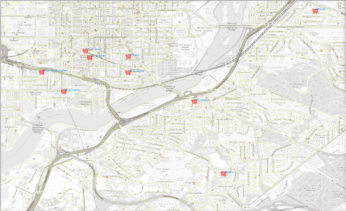 Perhaps my consultancy is successful because I understand the language necessary to make the project collaborative. Here are a few nuts and bolts:
ESRI User Conference
The important take-away is that there is not a singular way to pursue geospatial skills.
It is better to fail in originality than to succeed in imitation. Herman Melville  "The humblest tasks get beautified if loving hands do them." —Louisa May Alcott I am writing a book on Python for Geospatial Data Analysis. Most of the really cool widgets or packages I discover end up in the book but every now and then--something is cool but not really aligned with the rest of the story. Open route service is free with a robust API that allows you to use navigation information, geocoding, isochrones, points of interest (POIs) and more. I wanted to immortalize the tool so decided you might find it interesting too. Did I mention its free? openrouteserviceI suggest you navigate to the Jupyter Examples and download the binder on GitHub. Or you can just follow along here. I work exclusively on a Mac but it is pretty easy to adapt to whatever your system your preference might be. You need to enter the following into terminal: mkdir ors-apartment conda create -n ors-apartment python=3.6 shapely cd ors-apartment pip install openrouteservice ortools folium You are basically creating an environment called ors-apartment that acts like a container for the necessary packages and dependencies. I used my later version of python and it still worked but if you run into problems you should be able to go as high as 3.7. I am going to assume that you will be working in the notebook so I am simply screen casting my computer images. You will be requesting a key after clicking on the API Playground and entering it in the code below where it says ‘your key’. The task at hand is you have located 3 potential new apartments/homes. Maybe you would like to find certain neighborhood features and you want to see which location has more bang for the buck. 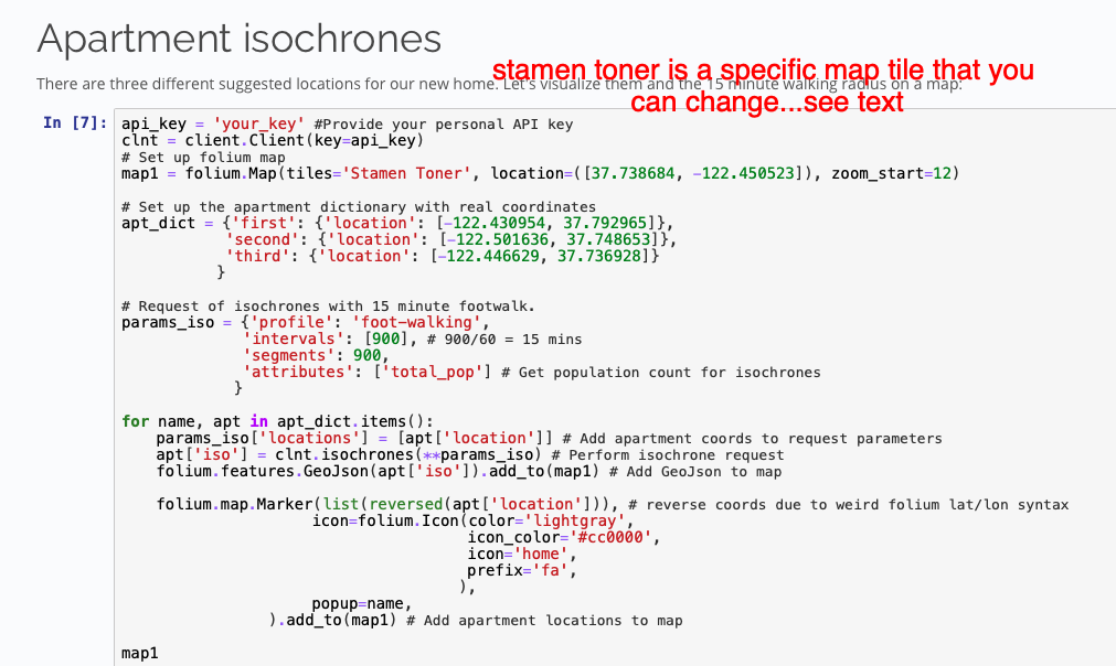 I left the locations the same but here is where you can have some fun with customization. It looks like they list lat/long as long/lat when creating the apt_dict so make sure you make the switch in your code if pulling coordinates from another website. You can also change the map tiles (Stamen)as they are open source tools from OpenStreetMap. 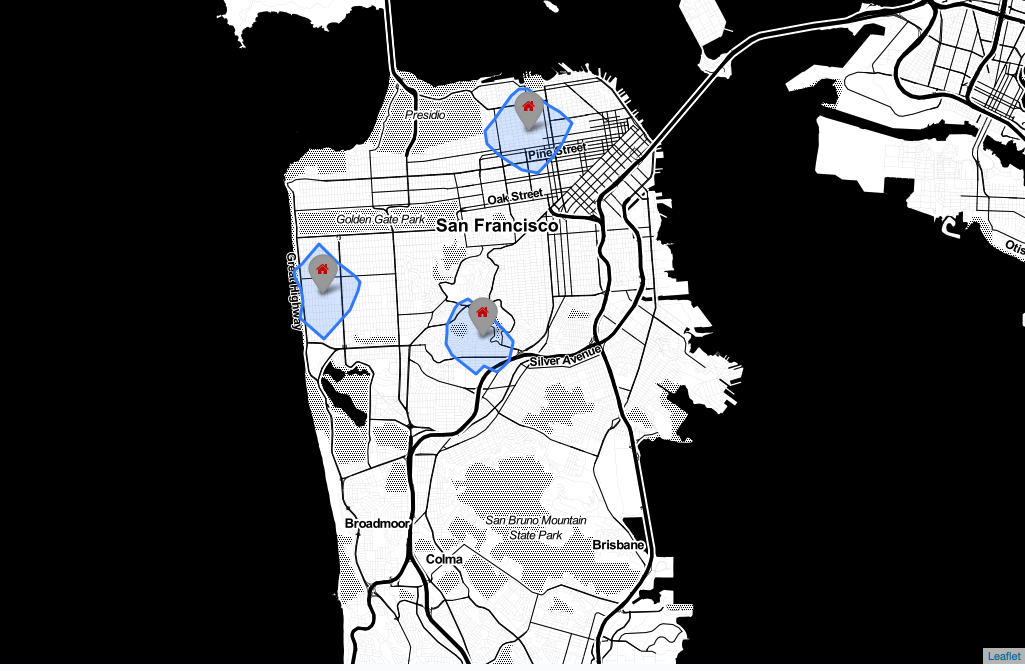 If you are relying on walking distance head over to the link https://github.com/GIScience/openrouteservice-docs to pick the features and the locations from the index--search for Places Response to find the category_ids. I selected museums, supermarket, and dog-park. The code as written in git-hub will throw an error if you don’t add the [0] between clnt.places and features (see below). 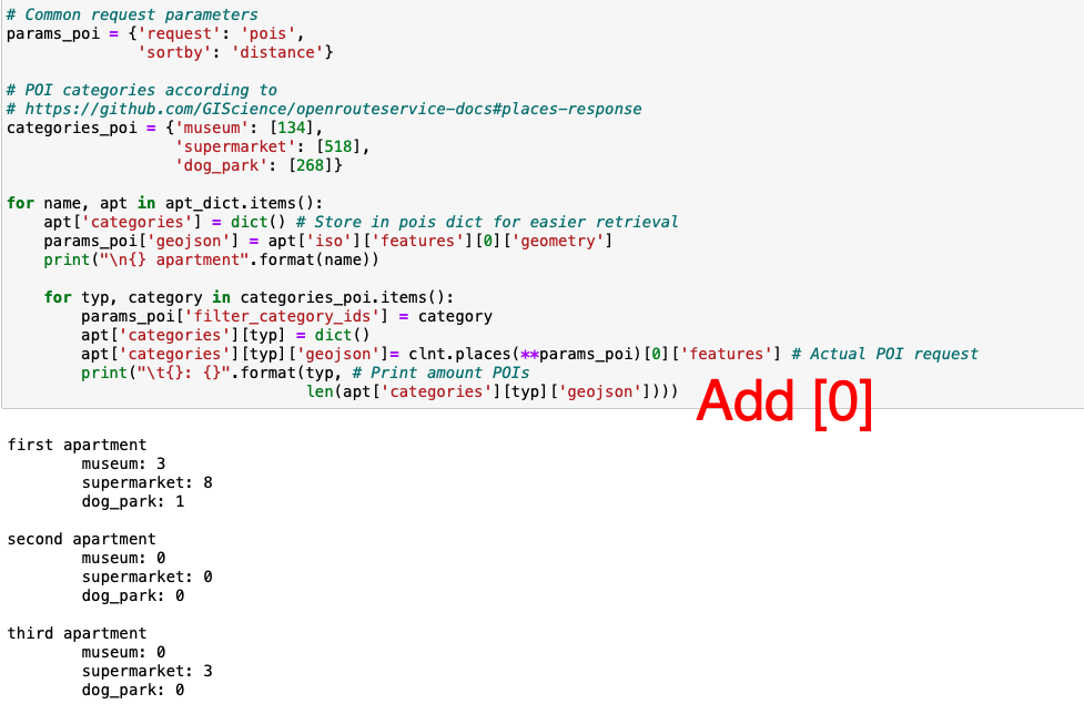 Once you run the code you can see one of the locations is completely out of the running. None of the attributes you were seeking are within your radius. The syntax for the code can be reviewed in the Folium documentation. The style_dict includes icons to identify the requested items you would like to see in your chosen neighborhood. I simply selected free font-awesome icons that would identify the locations. If you render your map and the tags are blank you either picked or dud or a paid service so keep looking. 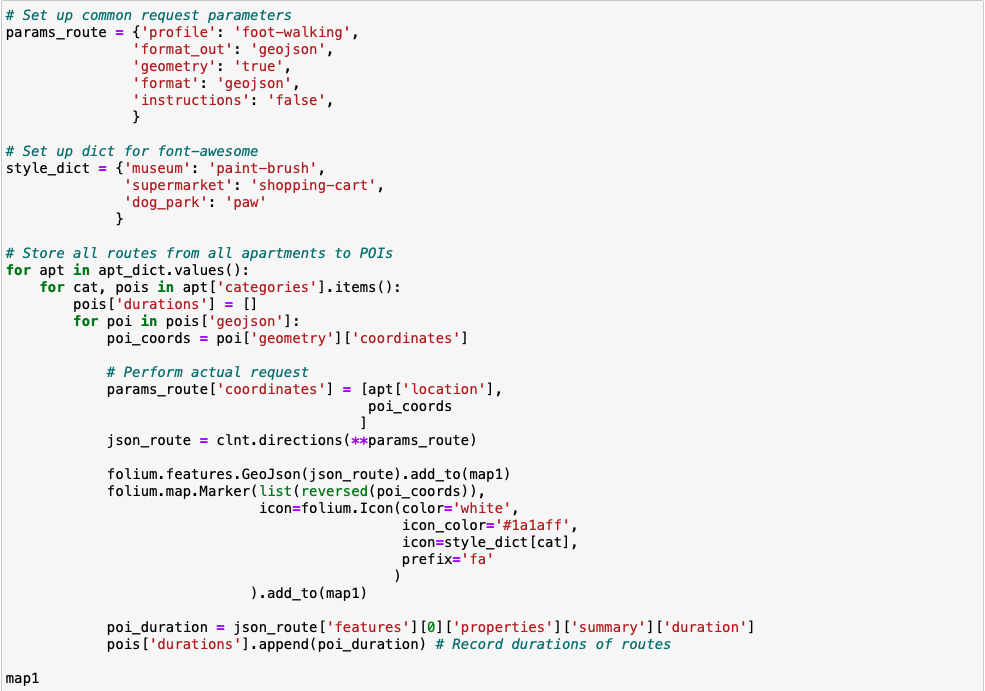 The map that renders below shows the neighborhood with the most of what you wanted to see near your new home. 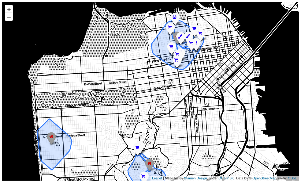 If the search had shown tighter results between the properties you could compare the distances and pick a winner. For the data I selected the zero values were problematic and only yielded distance for apartment 1. 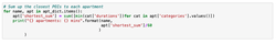 There is one more cool thing below. You can design your own atlas and bring it into the field with you. Click the link to find out how. One more really cool thing...make your own atlas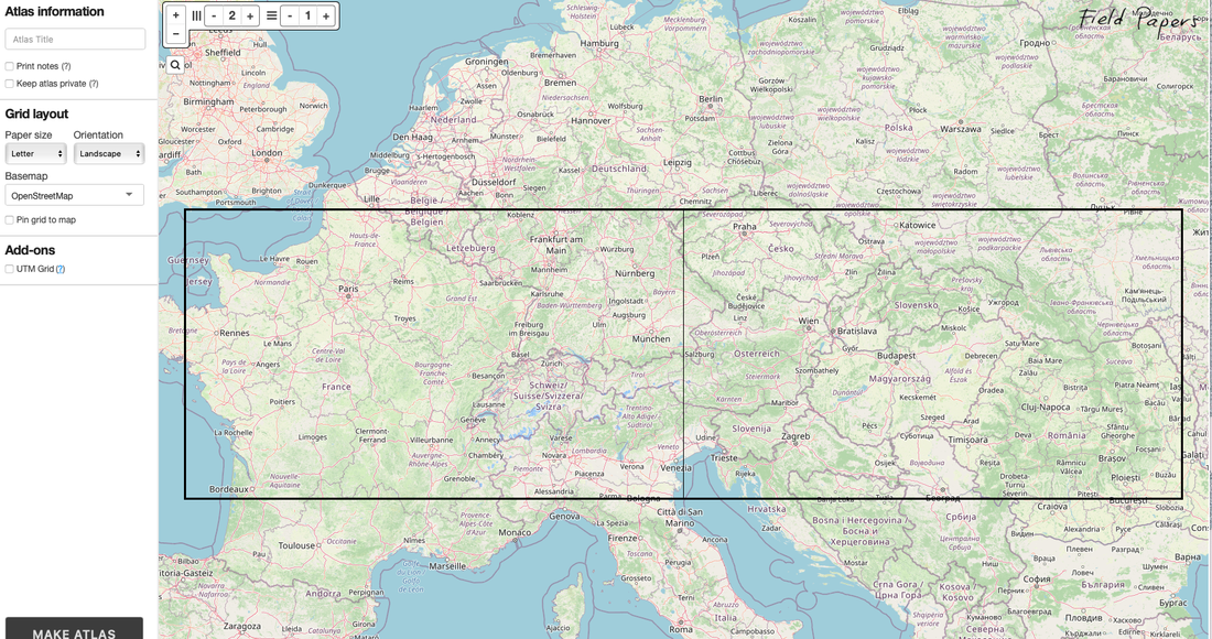 What’s in your genes? About 98% homology with chimpanzees for starters.  The human brain has 100 million times the number of neurons a sea slug's brain has. Where do those differences in quantity come from? At some point in their development, all embryos — whether human, chimp, rat, frog, or slug — must have a single first cell committed toward generating neurons. That cell divides and gives rise to 2 cells; those divide into 4, then 8, then 16. After a dozen rounds of cell division, you've got roughly enough neurons to run a slug. Go another 25 rounds or so and you've got a human brain. Stop a couple of rounds short of that and, at about one-third the size of a human brain, you've got one for a chimp. Vastly different outcomes, but relatively few genes regulate the number of rounds of cell division in the nervous system before calling a halt.-- Robert Sapolsky Discover Magazine The first time I heard this statistic I was working on a children’s book, “There is a Frog in My Genes”.This was around the time that Dolly the sheep had been cloned and it seemed appropriate to level-set the conversation. The file with rhymes and draft illustrations is buried in a hard-drive somewhere but I find the 98 to 99% chimp analogy to be most compelling.  First of all, and maybe the most important take-a-way, is the power of 2 percent. Think of what you could do 2% better that could make a big difference in your life? There is an article that outlines what a 1% improvement can do--let’s use that and think that clearly 2% would be even more massive--excluding the law of diminishing returns for a moment. James Altucher reinforces the idea that you don’t have to be better than the other person. The improvement should come from within. I haven’t worked the math but the claim is if you are 1% better every day you will actually be 3800% better in just one year. Tragically if you become 1% worse you basically disappear. You lose 97% of your value after one year. You can read Altucher’s nudges in Physical, Emotional, Mental, and Spiritual health here. I am going to list my rag tag thoughts in no particular order. They are making the cut because I don’t see them on many lists but I think they belong. They matter to me but your mileage may vary. 1. Begin your day with a small success -- Atomic Habits I commit to running most mornings. When you meet your commitment it is a win. They begin to build throughout the day and lead places you didn’t even know you were headed. 2. Learn something Seth Godin said something in his book, The Practice: Shipping Creative Work You are not the boss, but you are in charge. Unless you only create work for your amusement, you clearly are not the boss. Those you serve have preferences and needs--this might require a modest amount of coloring within the lines to reach your smallest viable audience. But because you are in charge, you can decide what skills you learn, what books you read, and even what conferences you choose to attend. The links to the books mentioned throw a few pennies my way. I don’t know how it works but I notice tiny payments of $3.50 here and $1.95 there from time to time. 3. Skill up--don’t get mad, get data. In full disclosure, although I authentically claim autodidacticism in geospatial analysis, there were several university degrees in the hopper before I tackled location intelligence. None of them specific to analysis. I launched with an executive online program in applied analytics from an Ivy League institution. The investment was in credibility because the real skill development, at least in Python, was due to Ted Petrou. If you want to learn Python--I mean really learn Python--explore his company website, Dunder Data. He also has YouTube videos. I enrolled in every MOOC I could find--bonus points if they were ESRI. One weekend I watched every ESRI conference video from my bike trainer. I took notes, made recordings, and referenced material I wanted to return to for several hours a day. I run quite a few trail miles each week and use those hours for learning. I listened to every episode of Mapscaping podcast. I wanted to understand the acronyms, ideology, and theory behind the science of geospatial analysis. The final bit was to code. Learn how to code Python to explore geospatial platforms like ArcGIS, QGIS, Google Earth Engine, and more. 4. Monkey see, monkey do Communicating needs to explore the other 2%--the bit we don’t share with our chimp friends. Although visual cues, auditory calls, and even fecal tossing may have their place in primate culture, we need storytellers. Are you able to describe a spatial algorithm clearly and concisely? Provide context about why we should care? I have been recommending the Opportunity Projects, Product Development Toolkit. The Opportunity Project has the tagline, “Putting America’s data to work for the people".The datasets are all worthy of a deeper dive. They hold stories and opportunity.  
I was recently interviewed for a podcast. I will share more when it is released as there are a few in the pipeline that I am very excited about. In a great conversation, with a great podcast host, you can easily forget that you have an audience. An audience that is far from homogenous so I made a list of topics that might appeal to folks interested in geospatial analytics.
It sounds easy but only if you think of two simplified but fairly accurate buckets of geospatial professionals. In one bucket you have the geospatial professionals that have an academic background in an university setting.They have studied theory, application, engineering, and perhaps a specific enterprise or open-source tool has emerged as their preferred platform. In the other bucket you can find deep subject expertise in medicine, public health, environment, finance, public policy--the list is vast. Along the way, the discovery has been made that “where” something is occurring on the earth’s surface might hold clues and insights that can become actionable. Geospatial tools start to bubble up to the forefront and the research and education become colocated in the question formulation. No more big data for the sake of volume. We now start exploring with a specificity and focus. I belong to this latter group. Google Earth Timelapse Glacial Retreat Alaska
While preparing for my podcast debut I pulled my thesis off of the shelf in my office. Constraints of Landscape Pattern and Fish Mobility on Ecologic Genetics of Lake Trout (Salvelinus namaycush) and Arctic Char ((Salvelinus alpinus) in Arctic Watersheds. I used microsatellites (genetic markers that follow inheritance patterns of genes) to measure the genetic distance in fish populations as a proxy for the mathematical basis for evolutionary theory. I may even have introduced the geomorphic tropic hypothesis model to my readers--gasp. The model is a decision tree that predicts where certain species are located based on characteristics of the landscape.
This bit of forgotten history did reveal a deep interest in cartography. I hired a cartographer to create maps for my thesis and was invited to watch his work. I might honestly say he still is one of the most interesting people I ever met. He introduced me to ebay before it was a big thing. He hunted for old maps with a depth and skill that was admirable. One of his unrelated finds was a coin machine recovered from an old motel that would allegedly shake the mattress if you fed it enough quarters. Years later his girlfriend at the time was a student of mine and we laughed at this shared absurdity. Chris also downloaded the theme of Sanford and Son to my old windows computer so I wouldn’t have to listen to the default chimes. For years, when I launched my computer the distinctive song would play loudly and make me smile. What has evolved is a deep appreciation for geospatial analysis--and Fred Sanford.
The fast fish, not the big fish, eats the small fish. Ali Babacan
 Symbolism being what it is, can be revealing in ways you might never imagine. I have been listening to Stephen King’s book--On Writing: A Memoir of the Craft. Because you can never pull too many threads without ripping the entire seam it will suffice to say that I have made a pivot to audiobooks for company on long trail runs. I figure at least I won’t have to hear the rabid coyote rip me apart if I bring along a distraction. The bit about the coyote is funnier if you live in my city. There was a coyote on the loose that could not be confirmed or denied as being rabid. It simply attacked a few people on the bike and running trail and either died or became bored. A friend mentioned her pepper spray would save her. She would spray it directly into her own eyes so she didn’t have to watch her demise. Maybe its ultra-runner humor but I still think it’s pretty damn funny.
Stephen King made a reference to “eat your eggs”. In his context (I believe) he was referring to the scene from a Raisin in the Sun where bold dreams and aspirations are being articulated but fall on skeptical--if not deaf ears. Almost like saying, “yada, yada, yada” that is all well and good--now just eat your eggs. Newly minted data professionals are not too different. When I am approached for career advice they often want to know the “how” before even appreciating the “what” or the “why”. I may need to stare at them blankly while reciting, “eat your eggs”. I believe you need to cultivate a passion for your data projects. Admittedly easier to do if your responsibilities aren’t limited to spreadsheets and dull finance reports. For example, Mapping Inequality is a website describing the “redlining” of the 1930s. In 1933, faced with a housing shortage, the federal government began a program explicitly designed to increase — and segregate — America's housing stock. Author Richard Rothstein says the housing programs begun under the New Deal were tantamount to a "state-sponsored system of segregation." In the map below you can see how the neighborhoods were classified in Decatur Illinois in the 1930s. You can select the geographical areas you are interested in exploring. 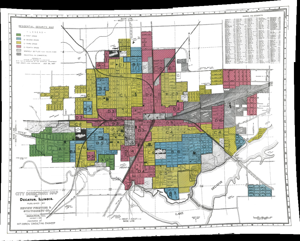 We can see patterns of the districts impacted by segregation in the maps available for inquiry. Census Viewer filtered by census tract and black race demonstrates the population demographics still somewhat predictable in the graphic below. 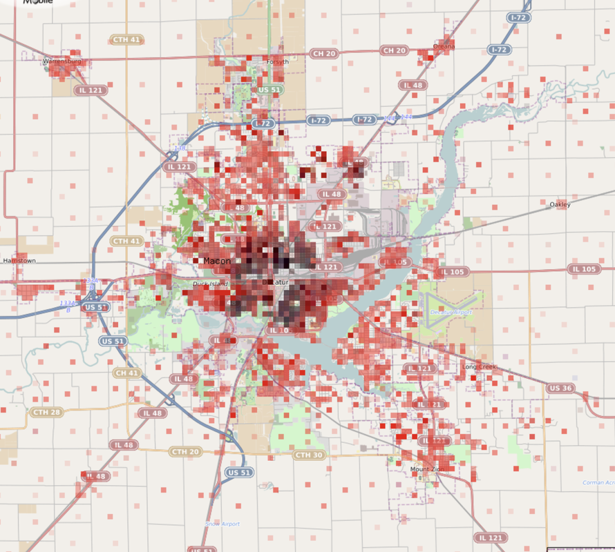 ArcGIS has a native living map depicting urban heat islands. Focusing on the same geographic area we can identify where the zones of heat intensification are within the city. An important thought or additional layer of exploration might be considerations of historically established land-use systems and the modern impact on climate change. Think about neighborhoods with higher square footage of asphalt, low levels of tree line, less green space and you will see higher land surface temperatures and down stream impacts of climate discrimination. 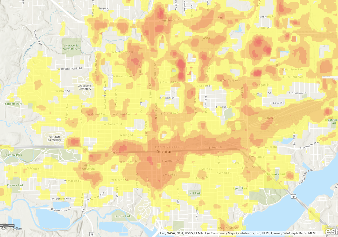 Additionally, most cities capture informative demographic data to enhance perspectives on the distribution of economics at the county, city, or census tract level. Additional questions create hypotheses to identify drivers of poverty density or non-low income diaspora from areas lacking economic investments. 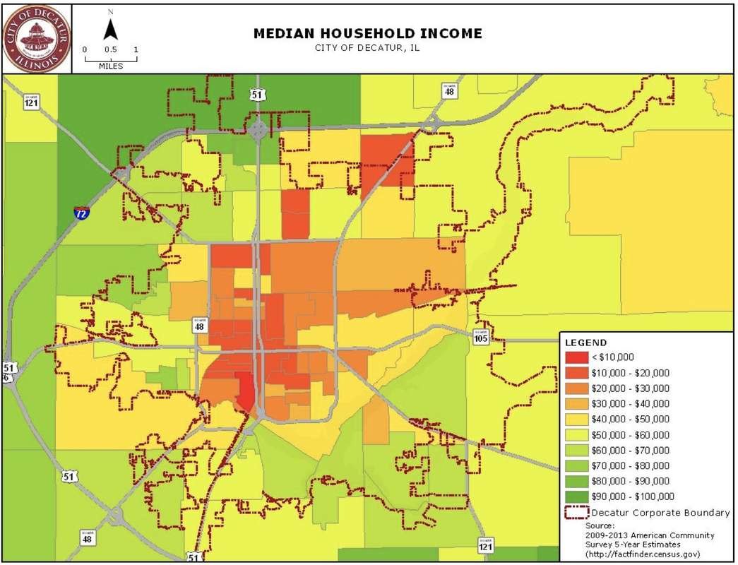 Tom Lisi from the Herald and Review highlights abandoned homes in Decatur cited for potential demolition."The left side shows a "heat map" illustrating pockets of Decatur with the most abandoned homes left to either county officials to manage, or already on the city's demolition list." 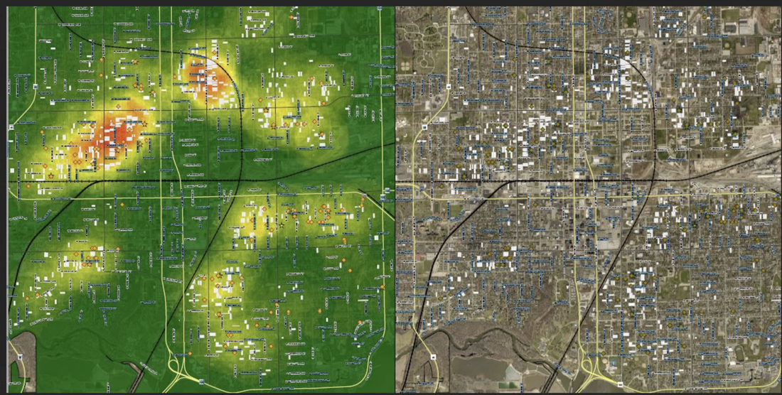 These examples are to show you how important it is to “scramble your eggs” before trying to make a souffle.
You need to build curiosity before you can bring a bit of creativity to your data questions or analyses. The quote by Glennon Doyle is often repeated in the edited form I borrowed for the title. The full quote, “This life is mine alone...so I have stopped asking people for directions to places they've never been.” Basically I interpret this as a reminder not to compare yourself to others. They haven’t walked your path. It also reminds me of discussing big issues in public health across our communities. If you aren’t including spatial perspectives I think the road is too narrow and perhaps the insights you are curating are distorted. Location intelligence adds an additional layer (pun intended) to data analysis. Herds of data analysts are guilty of mooing the sound “big data” perhaps attempting to direct attention to their own efforts or skills. When I hear the term, I think of data without a story, lacking a formulated question, and most importantly helpless to motivate or change behavior.  When we appreciate the “where” of large datasets we can suddenly reveal deeper insights. We create buckets and filterable data readily available to tell unique curated stories. For example, it appears easy for many to wave away the inevitability of climate change. We can do better. As journalists, data visualizers, analysts, and professionals that use graphics to communicate and share narratives we should focus on data literacy, skill development, and if nothing else--how not to be duped by low value information. How else can you explain the persistence of the spreadsheet? How compelling of a story can you weave with this spreadsheet? 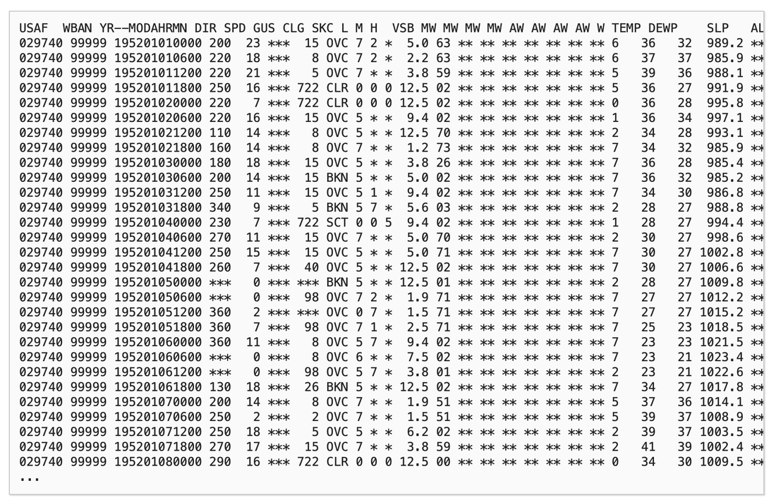 Once we visualize the data we can see trends missing in our initial glance at the spreadsheet. Fluctuations in global temperatures reveal the temporal aspect of climate change but what we can’t see here is the spatial component. 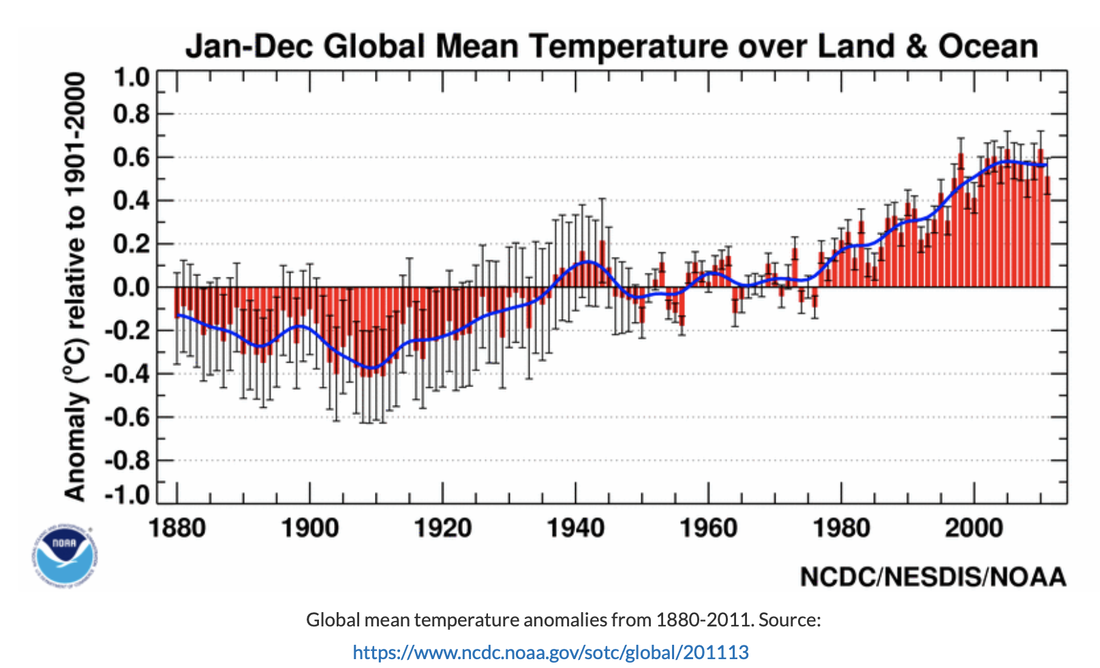 What happens if we sacrifice the temporal aspect for the spatial? This snapshot demonstrates a global perspective but how about getting both integrated into a single visualization. 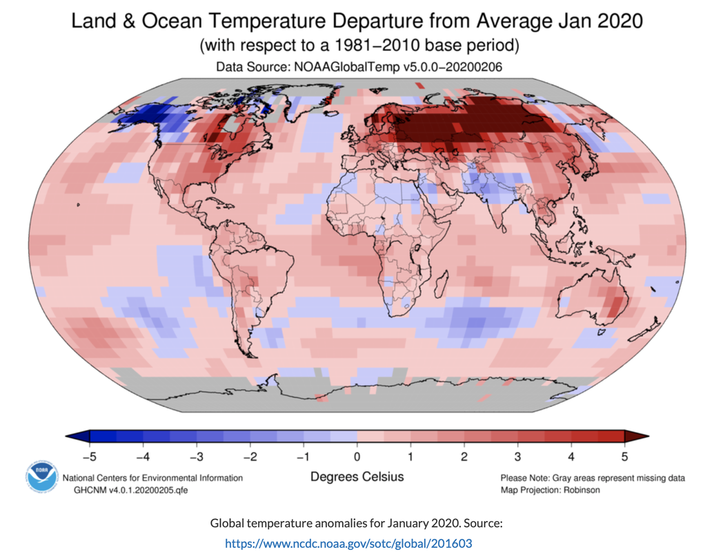 Temperature Anomalies by Country This pill plot does a great job on the global setting to show when anomalies become more routine than exception. Look what happens in the 1970s on a systemic scale. The last graphic reminds me a bit of my recent discussion on Chord Diagrams hosted by Jon Schwabish, One Chart at a Time (below). We can now look at country level (US is at the top) and region level once we watch the temperature change that also included predictions into future decades. I was welcomed to Clubhouse recently and joined a GEOSPATIAL CONNECTIONS community where we discuss climate change and how best to communicate the risks and potential solutions. You can reach out on twitter for an invite. I have a few that I am happy to share with anyone looking to join the community. Creative Commons License I first saw these images in a class that I recommend for the geospatial data curious--GEO-PYTHON 2020  You can follow along on Substack. Subscribers can get step by step “how to” sessions either within the newsletter or pop-up zoom sessions. So far we have talked about geo-python skills, QGIS, Tableau, and even blogging. Don’t become a mere recorder of facts, but try to penetrate the mystery of their origin--Ivan Pavlov3/10/2021
Leaning into the silver lining a bit more, my consumption of podcasts tripled. I didn’t become brilliant or anything but my questions were definitely better. Nothing makes you brilliant-adjacent faster than better questions.
For example, I often facilitate data discussions about Anti-PD-1 Therapies. These are straightforward discussions because you can access de-identified open source data from the US FDA Adverse Event Reporting System (FAERS). Many of the pharma types in my workshops are focused on the profits made from the leading drugs. Executives and marketing agencies dissect the positioning and marketing strategies of the branded drugs in the space and point to strategies you can emulate. I like to talk about the patients. These are highly toxic drugs being introduced into sick patients. What are the risks? What are reasonable side effects to expect? How does overall survival compare to standard therapies? Are there clues as to which patients might have better outcomes? 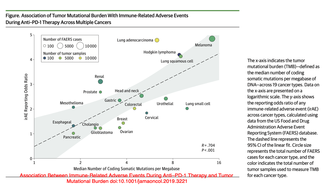
My point here isn’t to discuss the actual data although we can if that is of interest. A recent podcast did an interesting job walking through the latest research utilizing a creative but impactful study.
I like to share examples of how to add a deeper insight by looking at a variety of data perspectives and resources.
Thanks for reading along! |