
A starter level ArcGIS account is reasonable. I think I paid $100 for one solid year. Buyer beware though--this is definitely an enterprise solution unless you are really careful not to bring in any data that will be automatically geocoded ($$$$$) or you store large maps and data on the platform. The price tag can bloat quickly. It was a great platform to simply learn about GIS and creating maps. Their conference sessions from last year are great educational opportunities and they offer an abundance of free tools, courses, and webinars. What they don’t offer is ArcGIS Pro compatible with MacOS. A deal breaker for me. Back in the early days of Tableau, I had to bootcamp my hard-drive and run windows on a partition. I hate Windows. When Tableau was available for MacOs I vowed to never return. Buh bye Alteryx. Yes, it might be my loss but there was also a lot to gain. ArcGIS online may be all you need. No software to install but there aren’t scripting functions unless you are on desktop version (ArcGIS Pro). The Living Atlas is amazing and after a quick tutorial you are able to build maps using their Census data layers and a wide variety of other ready built datasets for you to explore. Happy to share a few videos I created on how to create a story map. 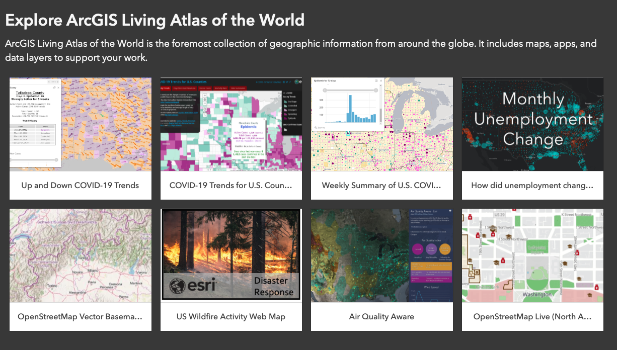 I am sharing a professional hack with you. Once I felt comfortable in my geospatial skills I switched to an open source platform--QGIS. There is a python plug-in readily available and you are off to the races. This will be the focus of the book. I am also trying out a little live forum--link below--where we can chat in real time.  Python is versatile (and free). I often demonstrate how to address the same question using 3 different methods. Look for these sessions to increase as I move through the book. I create and test a variety of visualizations and often perfectly great maps are too twitchy for a book where many users will be using different software. I will include them here for our discussion and in future blogs and newsletters. Click to register Geospatial Roundtables and other discussions 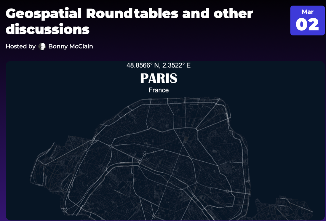 
There was an art exhibit called “Fields of Light,” by Bruce Munro, which consisted of acres in the desert on a hillside of lights that slowly pulsated, asynchronously, in different colors. It was the nighttime. It just made me think in a different way about what it might be to wander inside a mind and what thought looks like. And to me, it was awesome, because it brought together so many analogies and metaphors and ways of thinking about thinking and visualizing it. I suddenly thought that this is what thought really is.--Frank Wilczek, On Being
Different artists have different styles. We don’t expect to find Renoir’s shimmering color in a different world entirely, the Beatles’ from another, and Louis Armstrong’s from yet another. Likewise, the beauty embodied in the physical world is a particular kind of beauty. Nature, as an artist, has a distinctive style.--Frank Wilczek 
Like many of you, I am balancing equal measure stacks of work to finish out the year and a wandering eye toward the prep for a scaled down holiday feast and celebration.
Last night my husband suggested we watch Charlie Brown Christmas. By we, it was just us. The kids were off in their own homes or upstairs enthusiastically engaged with an online posse of Valorant tactical team players. Steve is not known for sentimentality but we have always watched the special; either live on a network or from our own personal copy. The first holiday music to play is more than likely our Vince Guaraldi CD. I know we can stream it from dozens of options but there is nothing like tradition--especially around the holidays.
Curious about a credit at the end of the cartoon reading, “Graphic Blandishment by...” I found the director, production designer, storyboard and layout artist, and background painter--Edward Levitt.
He also coined the famous credit used for many years at the end of the Peanuts specials—Graphic Blandishment. “Blandishment” is defined as “something that tends to coax or cajole,” which speaks to Levitt’s modesty and his view of the role he played in the filmmaking process.--RIP: Edward Levitt, 96, Disney Background Painter and Cartoon Modern Designer
Thinking of the word ‘blandishment’ in the context of graphics is brilliant. “A flattering or pleasing statement or action to persuade someone gently to do something.” Well, yes. That is pretty much data visualization in a nutshell, right?
Here are a few year end thoughts from the newsletter, Mumble, Ponder, Delegate over on Substack. I pulled it out from the paywall to share with you. This specific post is from The plausibility of factual information--here are summarized ideas from a year that has been nothing but challenging, heartbreaking, and illuminating. 
Be safe my friends and have a happy holiday season...
Hope Smiles from the threshold of the year to come, Whispering 'it will be happier’--Alfred Lord Tennyson 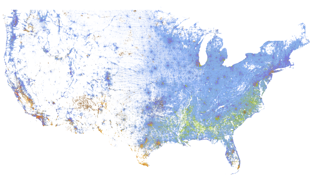
A few years ago I entered the entrepreneurial space as a “newly" minted applied data analyst. Although I had been working along analysts and data scientists in my work as a medical writer and outcomes professional, it was more of an observed curiosity than an immersive existence. Somewhere along the line I began asking questions. I hesitated at first not wanting to appear ignorant but quickly noticed vague responses to questions I would have thought had straightforward responses.
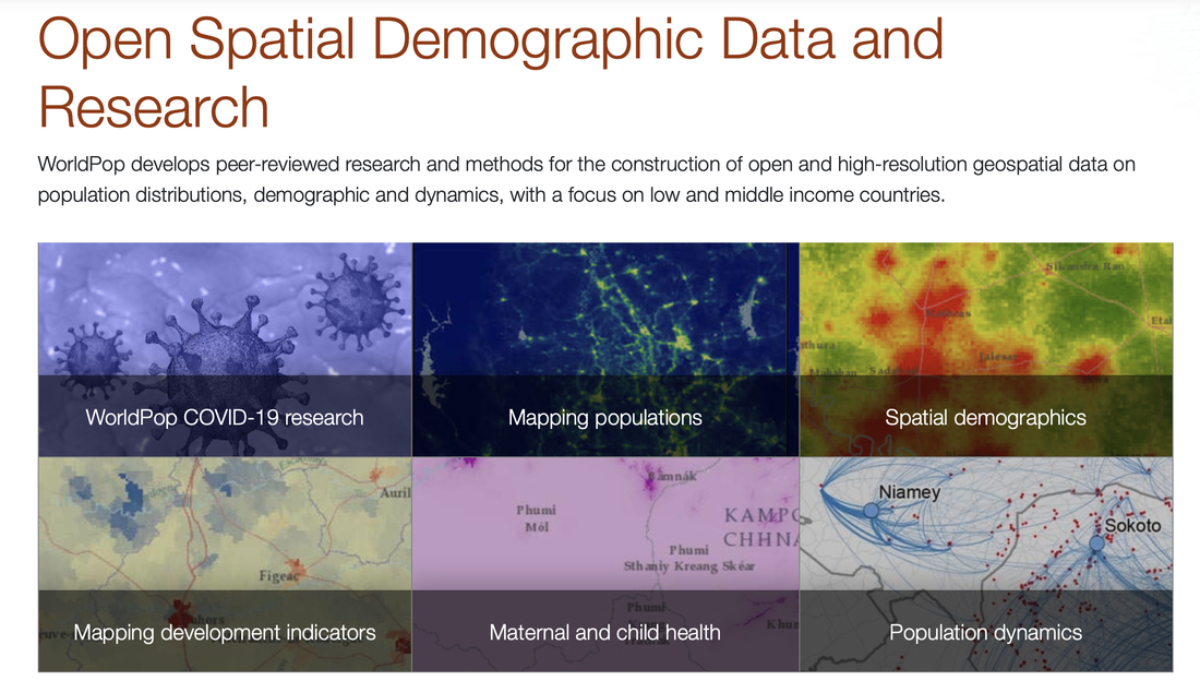
Curiosity morphed into agency as problems presented themselves and needed viable solutions. But whatever that sound is when a record scratches to halt forward movement in a movie--insert that here. Collaborative efforts to improve data collection and processes were not hailed as the “secret sauce” I had imagined. Here is the rub. Data literacy was lagging the needs by quite a significant gap. Most data departments (and I use the term loosely) consisted of finger pointing, a small measure of chest pounding, and gasps of “But we have always done it this way...”. Fast forward to today and I am contractually obligated to author my first book on geospatial analytics. How I got here and why will be the subject of more than a few future posts. I want to first introduce you to an organization that does a great job illuminating the importance of thinking spatially (below). We all respond to graphic images. Instinctually we are grounded in the what and where of an image. Any student of data visualization recalls pre-attentive attributes--the preliminary detection of the image. But we often don’t appreciate the attentive attributes as well. Attentive attributes call in to play the higher centers of the brain to make inferences following four principles as described by Eric Kandel--Nobel prize winner in Physiology or Medicine: 1. Disregarding details that are perceived as behaviorally irrelevant in a given context, 2. Searching for constancy, 3. Attempting to abstract the essential, constant features of objects, people, and landscapes, 4. Comparing the present image or graphic to images encountered in the past. “Perception is the process whereby reflected light becomes linked to an image in the environment, is made enduring by the brain, and becomes coherent when the brain assigns it meaning, utility, and value.--Eric Kandel, Reductionism in Art and Brain Science."
What do we mean by “spatial literacy”? Let’s take a look. Location data looks at the environmental or first-order effects and the second-order or interaction effects. We can simplify processes into data-driven and model driven. But let’s not get ahead of ourselves. We are first looking to summarize the data. What are the characteristics of the data? The testing begins during model-driven analysis.
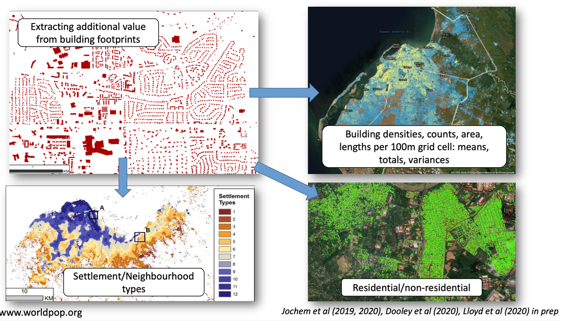
WorldPop data is the perfect place to start understanding the process of mapping and providing “high resolution, open and contemporary data on human population distributions, allowing accurate measurement of local population distributions, compositions, characteristics, growth and dynamics, across national and regional scales.” You won’t find a lot of US data here but I have successfully used the methods discovered here on US CENSUS data for example.
There really isn’t--at least not yet--a handbook to guide you through the insights needed to make granular assessments about poverty beyond quantitative assessments but applying even a few of these insights to our data questions can only improve our ability to provide a 360 perspective.
Spatial data reminds me of a useful definition I once heard of big data. It isn’t the volume that makes it big--it is the interactivity of blending different datasets to answer complex questions. This is visually appreciated when we look at layers of data integration to examine patterns in geographic regions.
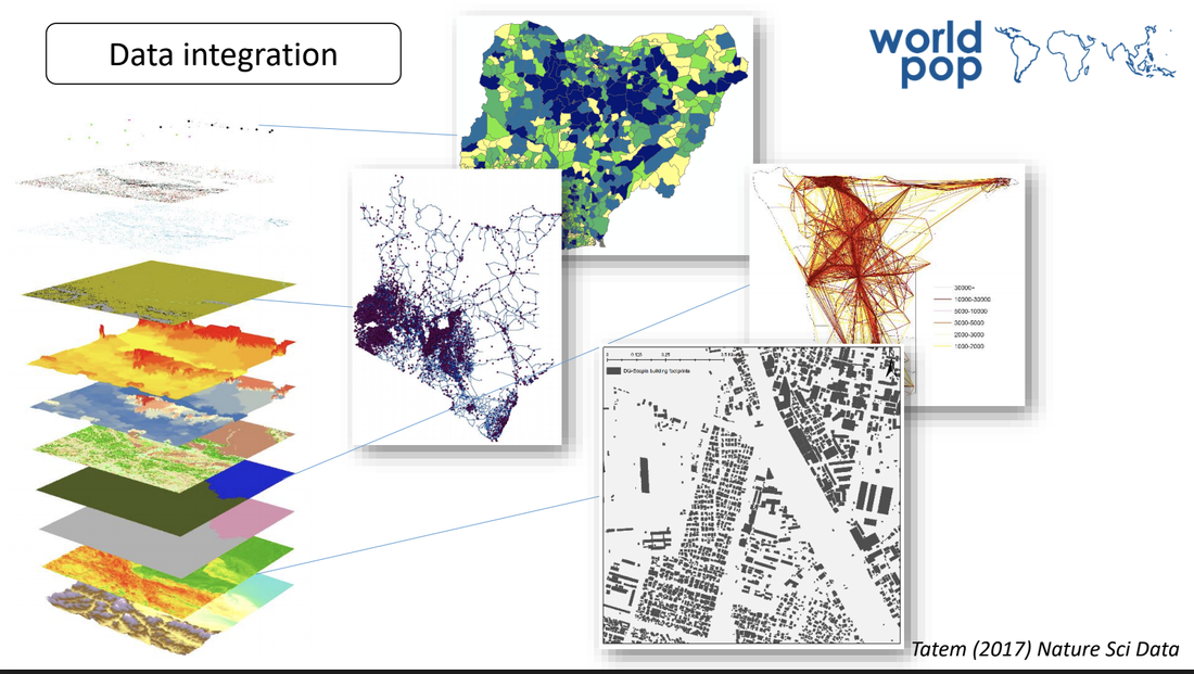
The ability to explore characteristics that influence differences in population density. It isn’t enough to simply drop a pin onto a map to indicate populations--we need context.
Summaries of the workflows will continue to be posted here. If you are interested in the detailed "how-to"--subscribe below:
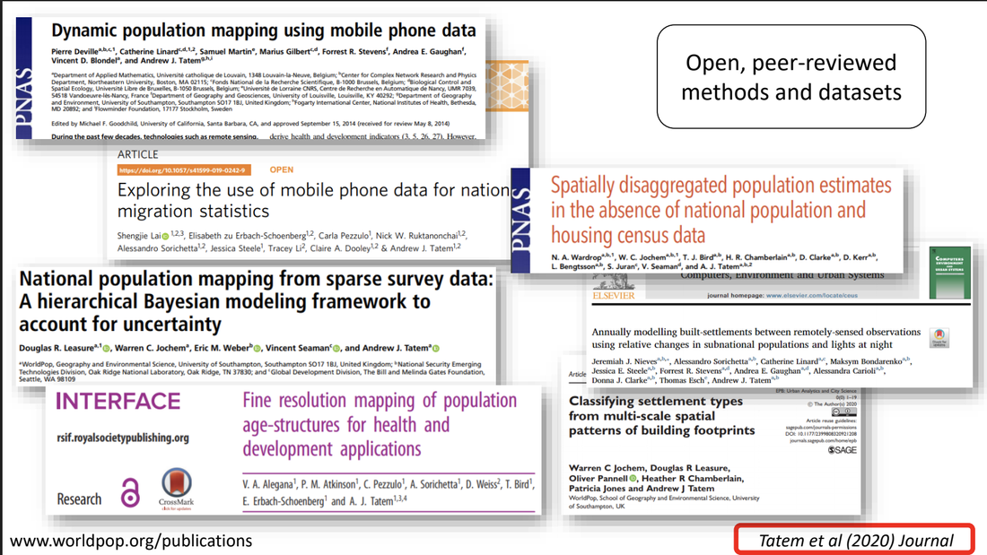
Graphics are from HDX Dataset Deep Dive on WorldPop’s Gridded Population Datasets.
HDX Humanitarian Data Exchange. There are 46 million Americans with Alzheimer's disease in their brain right now, but no symptoms. --Richard Isaacson I have two blogs. More like one and a half. The other one is sort of a repository for information. I don’t pay for that one and at times I think it may have run its course but then I think of something else I want to park over there. The name of it is Alzheimer’s Disease: The Brand and there is plenty of value over there but also plenty I have learned that I replicate over here. For example, you really need to do your homework. The hard tedious bits. I long advocated the work of Dr. Dale Bredesen and I am not exactly recanting but it never occurred to me to look at the data he cited from the literature in support of the claims made in his writings.The person that dug into the findings and the data in the resources cited by Dr Bredesen was Dr Peter Attia. I have listened to his podcast and read his posts for years. He has evolved into more of a pay to play model for some of his podcast show notes and communications so I was unable to locate the conclusion. Regardless I still follow many of the earlier recommendations simply because they still make sense. An article in The Washington Post, Atypical forms of dementia are being diagnosed more often in people in their 50s and 60s caught my attention. All gloom and doom and no grounding in the granularity needed to describe the known heterogeneity of Alzheimer’s Disease. My dad had Alzheimer’s disease likely because of head trauma in a car accident years before we were able to make the probable diagnosis. So with uncertainty regarding any long term benefits from the lifestyle recommendations in the literature I decided to focus my attention on longevity and prevention--the focus of The Drive. Here is a direct link to the podcast Alzheimer’s disease prevention--patient and doctor perspectives 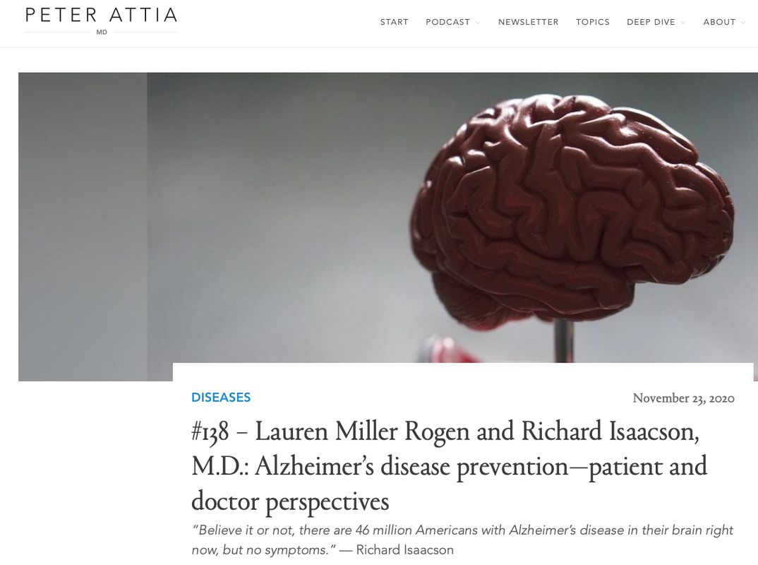 And it sounds like what you're saying is Alzheimer's is not really one disease. it's an umbrella term that encompasses many different diseases of the brain that have some common features in the way that all cancers have some common features, cells don't respond to normal signaling, but there's this notion that someone could have a form of Alzheimer's that largely spares the frontal cortex and therefore preserve some higher order functioning versus another person that has.--Peter Attia Here is an additional resource--an article authored by both Peter and Richard (as well as others). Click on title for full article. Individualized clinical management of patients at risk for Alzheimer's dementiaIntroduction Multidomain intervention for Alzheimer's disease (AD) risk reduction is an emerging therapeutic paradigm. Methods Patients were prescribed individually tailored interventions (education/pharmacologic/nonpharmacologic) and rated on compliance. Normal cognition/subjective cognitive decline/preclinical AD was classified as Prevention. Mild cognitive impairment due to AD/mild-AD was classified as Early Treatment. Change from baseline to 18 months on the modified Alzheimer's Prevention Cognitive Composite (primary outcome) was compared against matched historical control cohorts. Cognitive aging composite (CogAging), AD/cardiovascular risk scales, and serum biomarkers were secondary outcomes. Results One hundred seventy-four were assigned interventions (age 25–86). Higher-compliance Prevention improved more than both historical cohorts (P = .0012, P < .0001). Lower-compliance Prevention also improved more than both historical cohorts (P = .0088, P < .0055). Higher-compliance Early Treatment improved more than lower compliance (P = .0007). Higher-compliance Early Treatment improved more than historical cohorts (P < .0001, P = .0428). Lower-compliance Early Treatment did not differ (P = .9820, P = .1115). Similar effects occurred for CogAging. AD/cardiovascular risk scales and serum biomarkers improved. Discussion Individualized multidomain interventions may improve cognition and reduce AD/cardiovascular risk scores in patients at-risk for AD dementia. 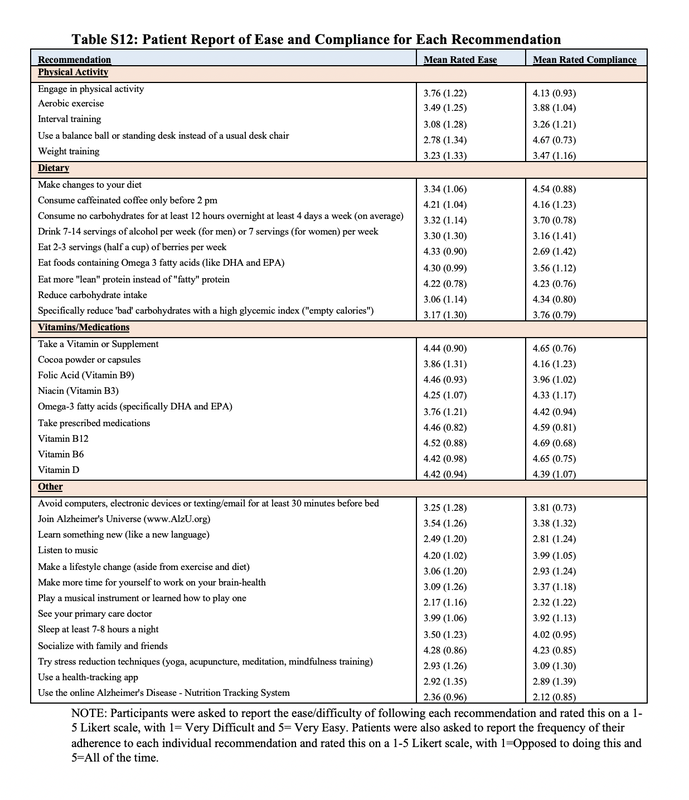 I will continue to share information, preferentially in this blog, due to the limits of a free Weebly account.
“Sentient beings are numberless; I vow to save them all.”--Bodhisattva vow


ivart was one of the first scientists to call attention to the observation that major transitions in evolution do not involve a single organ changing; rather, whole suites of features across the body have to change in concert.
Some Assembly Required Decoding Four Billion Years of Life, from Ancient Fossils to DNA--Neil Shubin
If you aren’t familiar with St George Jackson Mivart, today is your lucky day. In a nutshell, Mivart was trolling Darwin’s findings in his seminal work, "On the Origin of Species".
But his question was important: If entire bodies have to change for any great transformation, and many features need to change simultaneously, then how could major transitions happen gradually?--Some Assembly Required Decoding Four Billion Years of Life, from Ancient Fossils to DNA--Neil Shubin
Charles Darwin responded thoughtfully and respectfully...
All of Mr Mivart’s objections will be, or have been, considered in the present volume. The one new point which appears to have struck many readers is, ‘That natural selection is incompetent to account for the incipient stages of useful structures.’ This subject is intimately connected with that of the gradation of the characters, often accompanied by a change of function.”--Neil Shubin
Lungs aren’t some invention that abruptly came about as creatures evolved to walk. Fish were breathing air with lungs well before animals ever stepped onto terra firma. The invasion of land by descendants of fish did not originate a new organ--it changed the function of an organ that already existed...the change did not involve the origin of a new organ; instead the transformation was, as Darwin said more generally, “accompanied by a change of function.”--Neil Shubin 
My thesis was in population genetics so this book is a win for me but it also reminded me of data. We take a class and are often surprised when the skills or tools are not easily assimilated into a work flow. It reminds me of the fish with the genetic equivalent of a lung.
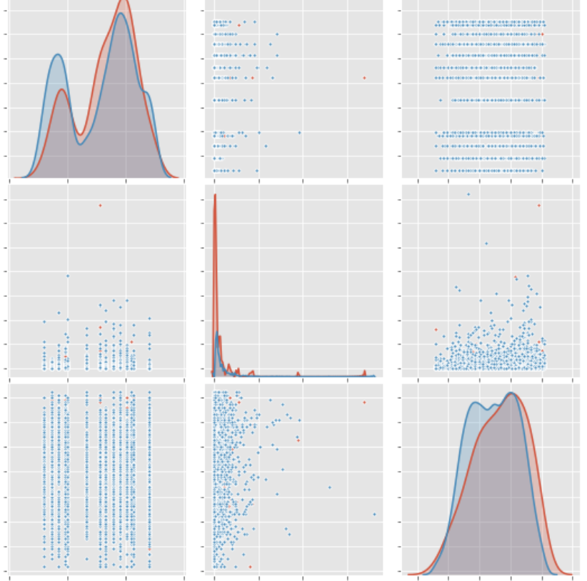
He doesn’t effortlessly stroll onto the beach and become a land dweller. There are gradients of success. There needs to be changes in a whole host of functions. Suddenly his watery environment has a drop in dissolved oxygen--mysteriously he relies on his lungs to weather the storm. Perhaps our data skills are like air sacs. They exist--we simply need to challenge them to innovate and evolve along with us. I don’t. Next question? I am only partially joking. The most common format for the output of most non-proprietary large datasets (at least in healthcare) seems to be CSV. Occasionally I can grab a SAS file but I think spreadsheets are here to stay. A CSV file has all of the formatting and formulas stripped out of the file so although they are still cumbersome--they work. This data is from the Household Pulse 2020 COVID household survey from the Census. You can readily see that the ability to gather any information about the shape of this data is limited. Writing a few lines of Python code can provide information about the shape of data and the variables included although unless you are familiar with the data, you will also need to download the data dictionary. This particular survey contains 82 columns and 132,961 entries or rows. 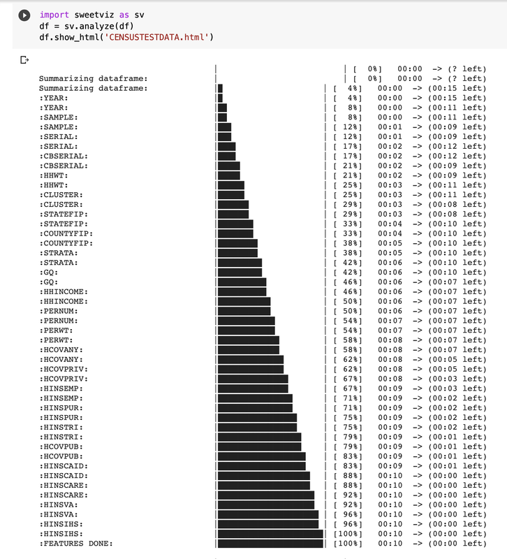
You can also explore data on CENSUS website and use their interactive tool. I usually start here and formulate data questions as I go. Reach out with any questions. The newly launched newsletter will be designed to included links for deeper dive tutorials or a focused narrative for less tech orientated subscribers. You can subscribe here. Because I am switching my existing list of subscribers to the old format over to the new format--anyone subscribing to the new format before the end of September will continue to have access for free.  
One thing many of us working in statistics and data literacy can agree on is the broken pedagogy and misalignment between maths and the existing teaching curriculum.
Now, because of COVID-19 we are taking that broken foundational model and moving it to remote learning--what could go wrong?
When I teach underlying mathematical principles in statistical or data science course I am leap-frogging over the memorization and boring bits and moving right to the application. Perhaps not ideal, but if the goal is to teach a team how to reach the part of the workflow where they can begin to curate insights from their data--a few corners are going to need to be cut.
Here is the rub though. They often learn more in the over-simplification because they never knew what they were doing down in the weeds anyway. For example, when you are data modeling--what is the shape of your data? We talk about linear, sinusoidal, or quadratic relationships. I write about it briefly in this blog--Maths in the real world. We all have heard the lamenting about why take calculus. “When am I ever going to use it?” Did you know derivatives can tell you a lot of information in the real world? How about whenever you think about rate of change of a function? Most recently while calculating the COVID-19 rate of positive tests for example. Also when we think of population growth in biology or marginal functions in economics. I like to introduce the brilliance of maths that we can stand back and marvel or appreciate. Recently, a post On apple trees and man described Benford’s Law. Discovering the not so random nature of big data provides a glimpse of the complexity but also mystery of math. A look beyond the rote memorization introduction that led many of us to avoid math simply out of principle. The quote below is from an informative discussion about online-instruction and how we need to Teach Better. Anyway. the key thing there is that the relevance has to be there for people to engage, and we also have to think about how do you kind of shape knowledge in the discipline? You know, how does a novice look at things? And chemistry is a great example because when you're a chemist, you get good at dealing symbols.
I think the problem with symbols and not knowing the storytelling of their shorthand stops so many of us in our tracks. If you are integrating classroom response systems or “clickers” where you can respond to student gaps and questions in real time you can avoid the tendency to gloss over esoteric terms and abbreviations and mistakingly assume that all students are joining you on the journey.
Online workshops and webinars have taught me that we can’t do any of it in a meaningful way without engagement. Here is an article, The Classroom Observation Protocol for Undergraduate STEM (COPUS): A New Instrument to Characterize University STEM Classroom Practices. I use it as a model for teaching technical topics remotely. I hope you will steal these ideas to make your work more engaging. 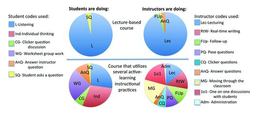
Here is the podcast episode where they provide a bit more context to the work being done in STEM specifically in Chemistry but you can easily connect the ideas to how we our teaching statistics for example.
It is remarkable how closely the history of the apple tree is connected with that of man.-- Henry David Thoreau
I’m not judging but I am not typically a binge-watcher of TV. A few notable exceptions would be Better Things (I watch it on a loop) and a new Netflix series, Connected. Latif Nasser is a science journalist with a likable foppish personality that intentionally or unintentionally hides a complex and thinking human.
Okay maybe “hide” is the wrong word. He is definitely packaging knowledge by distracting us from the "veggies in the sauce". You aren’t aware of how important and technical these topics are because they are seasoned with a bit of graphic artistry and film noir. All of the episodes will draw you in. The 3rd episode about “Dust” explains how the archaeologic remains in a dried lake in the Sahara desert replenishes phosphorus washed away by the rains in the Amazon basin. And other fun facts I had no idea about. These dust storms are visible from space and influence weather systems as well as our health and wellness. Connected: Digits (episode 4 in series)
The connection running throughout the series is attributed to the “Hidden Science of Everything”. If you work in science or with data you likely are familiar. We know that skills in data science or research findings for example are not homogenized and isolated bits of information. But too often we create silos of knowledge any way. Instead of thinking cinematic we think linear. Learn this skill. Now this one. Okay here is another. A piecemeal attempt to understand the chaos and intersectionality of everything. I am a big advocate of pushing around the edges of seemingly disparate ideas until we detect a slight alignment.
The episode about digits introduces us to Benford’s Law. Back in the day before calculators, books of logarithms were published. Observation of a wide variety of data sets yielded something interesting. The random numbers were not random after all. Their distribution was following an unknown pattern. Unknown--but quietly present in all of the data. Impossible to not see once you become aware of its presence. 
You can read more about the history of Benford’s law over at The Conversation. Or explore by visiting the page below (simply click on the image). There is a wide variety of datasets available for you to apply the law and see what happens.
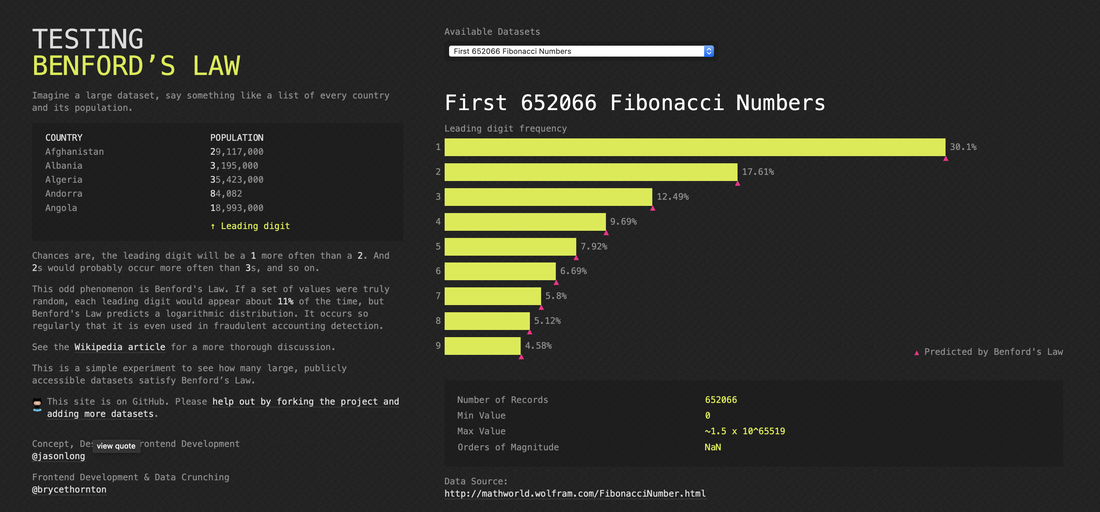
You can dig deeply over on Wikipedia as well. Benford's law, also called the Newcomb–Benford law, the law of anomalous numbers, or the first-digit law.
Thinking outside of our specific box not only broadens our awareness but allows us to see the vast number of “boxes” on the horizon. |