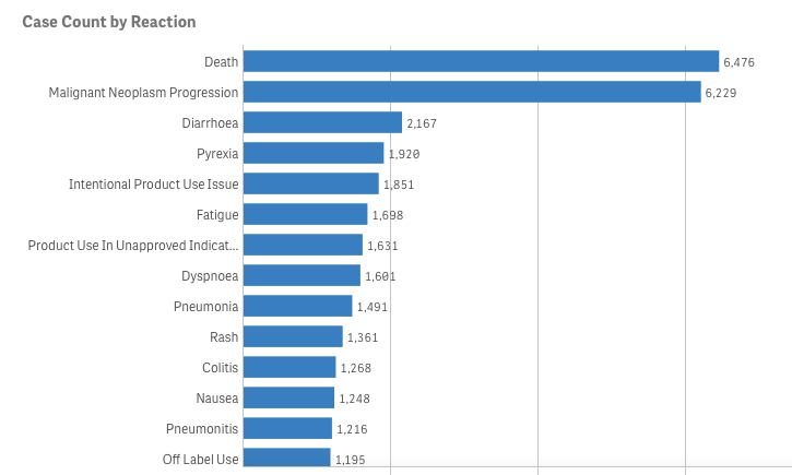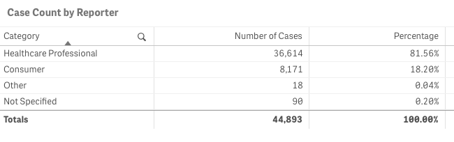
Let’s pretend (similar to my last project) that you are an academic center with a robust CME department. You want to avoid data dumps and attempting to educate community oncologists or physicians on simply the epidemiology. They know the science--the problem is, the data is problematic. For example, in the last 5 years there have been 28 randomized controlled trials published. If I decide to limit to simply clinical trials, there are 71. If I filter simply by key word search immuno-oncology and 5 years, there are 1,761 results. Educators need to start here. Focus and distill the information into meaningful topics. A recent article, Clinical Trial Evidence Supporting US Food and Drug Administration Approval of Novel Cancer Therapies Between 2000 and 2016 revealed the following key points: Question What are the available data on cancer treatment outcomes for new cancer therapies approved by the US Food and Drug Administration? 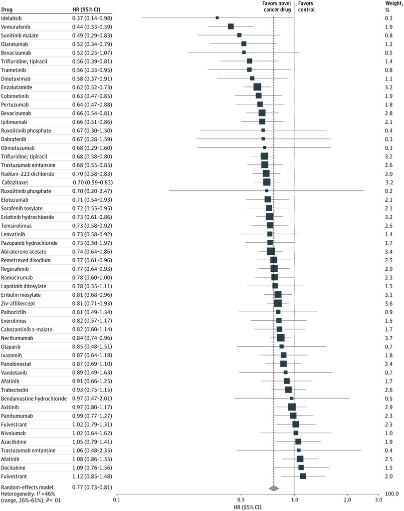 I don’t want to gloss over the importance of understanding a clinical graphic (you need to learn how. Period.) but in this case I found the data in this clinical report secondary to identifying the education gap for health care providers treating patients at the point of care. Which patient might benefit, from which drug, at what cost, and at what dose? Interviewed physicians revealed they had no idea the overall survival benefits were so small. First, we can explore the FDA Adverse Events Reporting System (FAERS) Public Dashboard. I am picking a drug for purposes of demonstration--I selected nivolumab from the graphic above, brand name Opdivo. Opdivo has a broad list of indications and although FAERS is free, I recommend using MedDRA (small fee) for complete data. But for our illustrative purpose--this will be fine. What we see in the data (search term “nivolumab") shows that there were 44,893 adverse events reported in FAERS. A total of 40, 152 are reported as serious (including deaths) with 13, 549 deaths reported as of June 30th, 2020. As we search for a focus for an educational intervention, although healthcare professionals reported the AEs 81% (36,614) of the time, patients or consumers reported 18% (8,171).
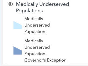
This list is certainly not complete but I wanted to show how a small fraction of available data can yield big insights for developing need assessments or any conversations about therapeutics--especially comparative highlights. There has been interest in examining inequity in screening and diagnosis for a variety of cancers. I am picking an example from one of the indications of our reference drug, nivolumab. Interesting trends to examine that begin to diverge after mid-forties. 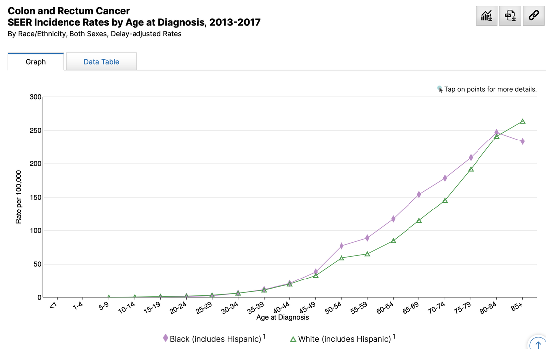 When working with populations, it is also important to locate demographic challenges to care access. There are many variables to examine, but here is one that is available from Health Resources & Services Administration (HRSA).
Do you have any data questions? Click the collaborator page and enter your data challenges.
We might select your challenge for the next round of data sourcing. Comments are closed.
|